Chart position — tracked daily by LaunchShots
Screenshot style breakdown
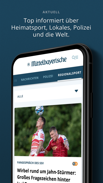
Sampled from 5 of Mittelbayerische News's App Store screenshots — background, accent and theme, measured by LaunchShots (not something Apple publishes).
#143444 bg
#34505E
#647C2C accent
#FFFFFF text
Screenshots
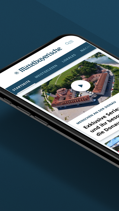
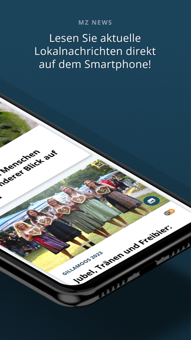
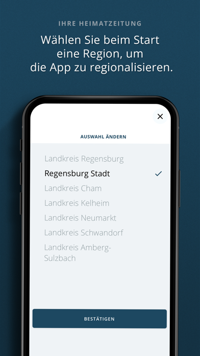
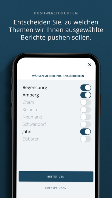
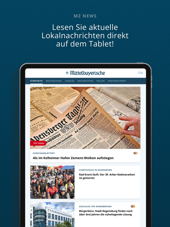
iPad screenshots


Icon palette
About this app
Die Mittelbayerische Zeitung online als Nachrichten-App. News lokal bis global. Freuen Sie sich über tagesaktuelle Meldungen aus Regensburg, Bayern – und der ganzen Welt. Bestandteil der kostenlosen Nachrichten-App sind auch Inhalte unserer Lokalausgaben Bayerwald-Echo, Kötztinger Umschau, Neumarkter Tagblatt sowie Wörther Anzeiger. Einfach starten: • Zunächst wählen Sie die Region aus, für die Sie sich am meisten interessieren. Die Inhalte der Nachrichten-App passen sich dann automatisch daran an. • Im zweiten Schritt entscheiden Sie sich für Regionen und/oder Themen, zu denen Sie Push-Nachrichten direkt auf Ihr Mobilgerät wünschen. Die Auswahl lässt sich unter „Einstellungen“ (rechts oben neben dem Logo) jederzeit ändern. Smarte Funktionen nutzen: • Nachrichten aus Ihrer Region: Regensburg, Oberpfalz plus angrenzende Gebiete, ganz Bayern und aus aller Welt • Überregionale News aus …
App details
What you can learn from Mittelbayerische News
Every shipping app on the App Store has gone through the same decisions you're working through right now: which screenshot goes first, what caption sits over it, which device frame to show, what color the background should be. The 9 screenshots above are Mittelbayerische News's answers to those questions — they're public, they're real, and they made it through Apple's review.
What the numbers say: Mittelbayerische News runs a dark set with one background colour (#143444) carried across every screenshot — the listing reads as a single poster when the shots sit side by side in search results. The accent colour we picked up, #647C2C, is the one to reuse for badges, arrows and highlighted words if you borrow this look. Hit Use this style to open the editor with these exact colours and drop your own screenshot in.
Notice the first screenshot in particular. It's the one users see in search results and on the product page, and it's where most apps spend their best caption and tightest design. Look at the proportion of background to phone, where the text sits, what one thing the image is trying to communicate.
Want to see how other News apps approach the same problem? Browse more News apps in the showcase.
Take what works into your own screenshots
Open LaunchShots and design your App Store & Google Play screenshots — pick a device frame, drop captions, ship in minutes. Free, in your browser.
Open the screenshot editor →Apps with a similar look
Closest background + accent colours among the listings we've analysed — useful when you want to see the same palette handled by a different team.