Chart position — tracked daily by LaunchShots
Screenshot changes — detected by LaunchShots
Screenshot style breakdown
Sampled from 3 of Webビリング-NTTグループの請求金額を確認・お支払い's App Store screenshots — background, accent and theme, measured by LaunchShots (not something Apple publishes).
#F4F4F4 bg
#D6D6D6
#0474D4 accent
#111111 text
Screenshots


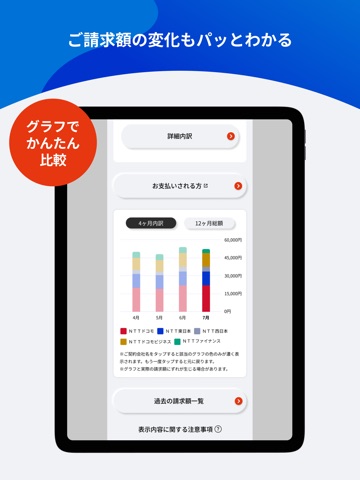
iPad screenshots


Icon palette
About this app
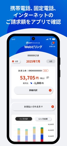
【NTTファイナンス公式アプリ】 ◆ Webビリングとは ・NTTドコモ、NTT東日本、NTT西日本、NTTドコモビジネスの携帯電話、固定電話、インターネットのご利用分でNTTファイナンスからのご請求額を確認できます。 ◆ 機能紹介 <請求内容のご確認> ・当月含む過去4か月分の請求金額・内訳の確認 ・当月含む過去15か月分の請求金額 <料金支払証明書・ご利用料金証明書> ・過去15カ月分の料金支払証明書 <お知らせ> ・Webビリングに関するお知らせ(システムメンテナンス情報等) <メッセージ配信> ・ご請求額掲載の通知 ・お支払期限を超過した旨の通知 ・各サービス提供会社から利用停止の通知 ◆ 月額料金 ・月額利用料無料(アプリのご利用にはパケット通信料がかかります) ◆ よくあるご質問 下記のよくあるご質問サイトをご確認ください。 https://contact.bill.ntt-finance.co.jp
App details
What you can learn from Webビリング-NTTグループの請求金額を確認・お支払い
Every shipping app on the App Store has gone through the same decisions you're working through right now: which screenshot goes first, what caption sits over it, which device frame to show, what color the background should be. The 6 screenshots above are Webビリング-NTTグループの請求金額を確認・お支払い's answers to those questions — they're public, they're real, and they made it through Apple's review.
What the numbers say: Webビリング-NTTグループの請求金額を確認・お支払い runs a light set with one background colour (#F4F4F4) carried across every screenshot — the listing reads as a single poster when the shots sit side by side in search results. The accent colour we picked up, #0474D4, is the one to reuse for badges, arrows and highlighted words if you borrow this look. Hit Use this style to open the editor with these exact colours and drop your own screenshot in.
Notice the first screenshot in particular. It's the one users see in search results and on the product page, and it's where most apps spend their best caption and tightest design. Look at the proportion of background to phone, where the text sits, what one thing the image is trying to communicate.
Want to see how other Finance apps approach the same problem? Browse more Finance apps in the showcase.
Take what works into your own screenshots
Open LaunchShots and design your App Store & Google Play screenshots — pick a device frame, drop captions, ship in minutes. Free, in your browser.
Open the screenshot editor →Apps with a similar look
Closest background + accent colours among the listings we've analysed — useful when you want to see the same palette handled by a different team.