Chart position — tracked daily by LaunchShots
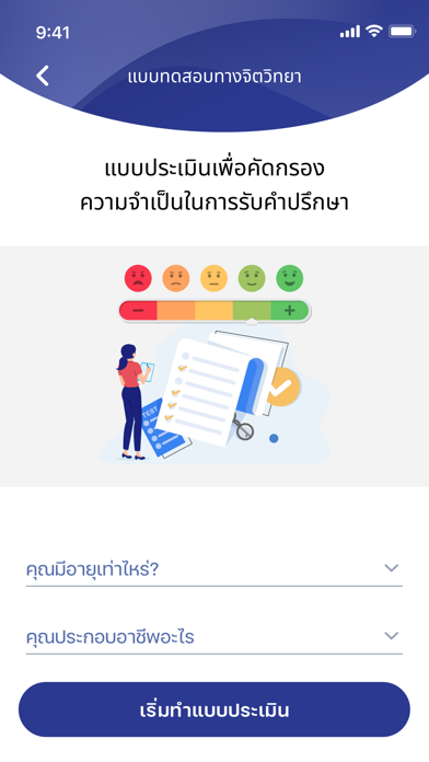
Screenshot style breakdown
Sampled from 4 of iSTRONG's App Store screenshots — background, accent and theme, measured by LaunchShots (not something Apple publishes).
#2C3C94 bg
#4957A2
#FCA494 accent
#FFFFFF text
Screenshots



iPad screenshots


Icon palette
About this app
ยินดีต้อนรับเข้าสู่การดูแลสุขภาพใจกับ iSTRONG เพื่อนที่พร้อมเข้าใจคุณในการเดินทางเพื่อพัฒนาสุขภาพใจ แพลตฟอร์มของเราเป็นเสมือนมุมผ่อนคลายสำหรับผู้ที่ต้องการความเข้าใจ การรับฟัง และกำลังใจในพื้นที่ปลอดโปร่งและเบาสบาย ที่นี่คุณจะได้พูดคุยกับที่ปรึกษามืออาชีพที่มีประสบการณ์ เพลิดเพลินกับเครื่องมือการดูแลใจ และรับเนื้อหาที่ช่วยสนับสนุนการเดินทางสู่ Well-being ของคุณ ที่นี่เราให้ความสำคัญกับความปลอดภัยของข้อมูลและการรักษาความลับของผู้ใช้งาน พร้อมทั้งความเข้าอกเข้าใจทุกการสนทนาเพื่อพาคุณเข้าหาความสมดุลและความสงบสุขในใจ iSTRONG ช่วยอำนวยความสะดวกให้กับคุณ นัดหมายเพื่อพูดคุยกับผู้เชี่ยวชาญที่เอาใจใส่ อ่านบทความที่เป็นประโยชน์ พร้อมเครื่องมือ เทคนิค และ How-to ที่น่าสนใจ และเข้าใจตนเองผ่านแบบทดสอบที่ใช้เวลาทำเพียงไม่นาน พร้อมทราบผลทันที Disclaimer: iSTRONG เป็นแหล่งที่ช่วยสนับสนุนและส่งเสริมสุขภาพใจ แต่ไม่มีการรักษาทางการแพทย์ ไม่ใช่การแทนที่การบำบัดรักษา กรุณาไปพบและขอคำแนะนำจากแพทย์จากคลินิ…
App details
What you can learn from iSTRONG
Every shipping app on the App Store has gone through the same decisions you're working through right now: which screenshot goes first, what caption sits over it, which device frame to show, what color the background should be. The 8 screenshots above are iSTRONG's answers to those questions — they're public, they're real, and they made it through Apple's review.
What the numbers say: iSTRONG runs a mixed light-and-dark set where the background shifts from screenshot to screenshot (first shot #2C3C94) — each image has to stand on its own, so the captions carry more of the story. The accent colour we picked up, #FCA494, is the one to reuse for badges, arrows and highlighted words if you borrow this look. Hit Use this style to open the editor with these exact colours and drop your own screenshot in.
Notice the first screenshot in particular. It's the one users see in search results and on the product page, and it's where most apps spend their best caption and tightest design. Look at the proportion of background to phone, where the text sits, what one thing the image is trying to communicate.
Want to see how other Medical apps approach the same problem? Browse more Medical apps in the showcase.
Take what works into your own screenshots
Open LaunchShots and design your App Store & Google Play screenshots — pick a device frame, drop captions, ship in minutes. Free, in your browser.
Open the screenshot editor →Apps with a similar look
Closest background + accent colours among the listings we've analysed — useful when you want to see the same palette handled by a different team.