Screenshot style breakdown
Sampled from 6 of Xuper TV GLOBAL: Drama y Cinta's App Store screenshots — background, accent and theme, measured by LaunchShots (not something Apple publishes).
#14041C bg
#34273B
#643434 accent
#FFFFFF text
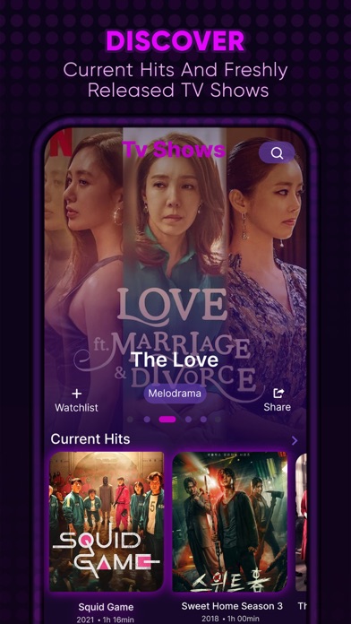
- #1Current Hits % i Squid Game Sweet Home Season3 Tt
- #2Where to watch Recommended >
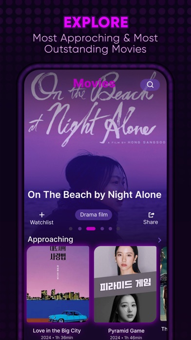
- #3Approaching > Love in the Big City Pyramid Game UN
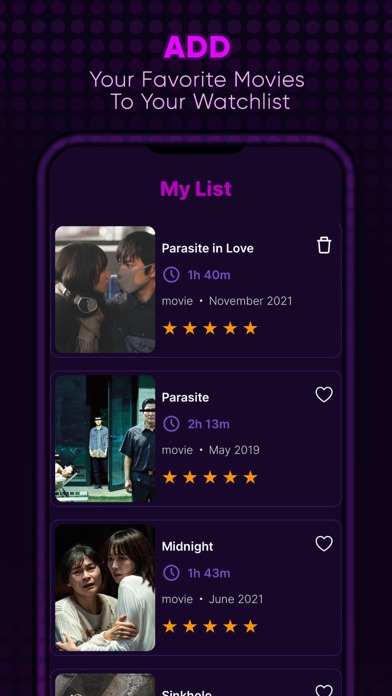
- #4Pa © Midnight o » movie + June 2021
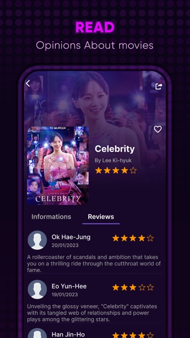
- #520/01/2023 A rollercoaster of scandals and ambition that takes you on a thrilling ride thr
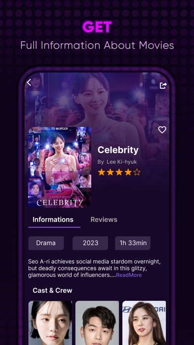
- #6Drama 2023 1h 33min Seo A-ri achieves social media stardom overnight, but deadly consequen
Captions read from the screenshots (OCR, may contain small errors): 6 headlines, 10.5 words on average (longest 15).
Screenshots

Icon palette
About this app
¿Buscas tu próxima serie para maratonear o la película perfecta para esta noche? Xuper TV GLOBAL: Drama y Cinta hace que descubrir qué ver sea más fácil que nunca. La app ofrece una amplia biblioteca de información sobre películas y series, cada una con páginas detalladas llenas de datos interesantes que te ayudarán a elegir tu próximo título favorito. Con Xuper TV GLOBAL, el interminable desplazamiento para encontrar algo que ver queda en el pasado. En solo minutos, recibirás recomendaciones perfectamente adaptadas a tus gustos. Sumérgete hoy en el mundo del cine y la televisión con Xuper TV GLOBAL y disfruta de la mejor y más rápida experiencia de descubrimiento de entretenimiento. NOTA: • Xuper TV GLOBAL está diseñada para descubrir películas y series, no para transmitirlas ni verlas. • Todos los detalles e imágenes de las películas provienen de TMDB.org, bajo licencia CC BY-NC 4.0…
App details
What you can learn from Xuper TV GLOBAL: Drama y Cinta
Every shipping app on the App Store has gone through the same decisions you're working through right now: which screenshot goes first, what caption sits over it, which device frame to show, what color the background should be. The 10 screenshots above are Xuper TV GLOBAL: Drama y Cinta's answers to those questions — they're public, they're real, and they made it through Apple's review.
What the numbers say: Xuper TV GLOBAL: Drama y Cinta runs a dark set with one background colour (#14041C) carried across every screenshot — the listing reads as a single poster when the shots sit side by side in search results. The accent colour we picked up, #643434, is the one to reuse for badges, arrows and highlighted words if you borrow this look. Hit Use this style to open the editor with these exact colours and drop your own screenshot in.
Notice the first screenshot in particular. It's the one users see in search results and on the product page, and it's where most apps spend their best caption and tightest design. Look at the proportion of background to phone, where the text sits, what one thing the image is trying to communicate.
Want to see how other Entertainment apps approach the same problem? Browse more Entertainment apps in the showcase.
Take what works into your own screenshots
Open LaunchShots and design your App Store & Google Play screenshots — pick a device frame, drop captions, ship in minutes. Free, in your browser.
Open the screenshot editor →Apps with a similar look
Closest background + accent colours among the listings we've analysed — useful when you want to see the same palette handled by a different team.