Chart position — tracked daily by LaunchShots
Screenshot changes — detected by LaunchShots
Screenshot style breakdown
Sampled from 6 of Hero Clash's App Store screenshots — background, accent and theme, measured by LaunchShots (not something Apple publishes).
#F4A43C bg
#D69034
#34C4DC accent
#111111 text
Screenshots
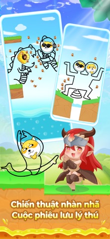
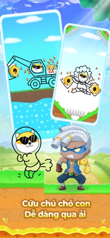

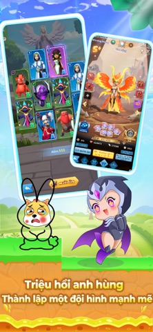
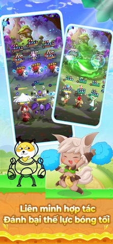

iPad screenshots



Icon palette
About this app
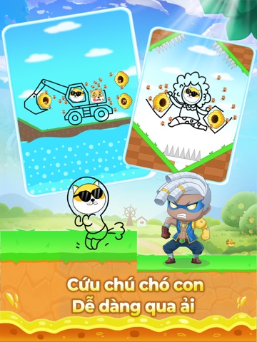
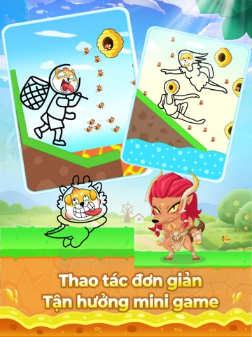
Quyết định phê duyệt nội dung kịch bản trò chơi điện tử G1 trên mạng số: 807/QĐ-BTTTT cấp ngày 16/05/2024 Link giấy phép:https://giayphep.abei.gov.vn/g1/131270 《Hero Clash》là tựa game thẻ RPG Idle phiêu lưu anh hùng nhàn nhã. Chỉ huy sáu thế lực hùng mạnh, năm nghề nghiệp chính, triệu hồi các anh hùng đa vũ trụ, tiêu diệt thế lực hư không tà ác ngay nào! 【Đặc Điểm Nổi Bật】 Giải Phóng Đôi Tay, Idle Treo Máy AI tự động chiến đấu, tận hưởng cảm giác chiến thắng. Bất cứ lúc nào, bất cứ nơi đâu, chơi game tự động, dễ dàng nhận thưởng và trang bị! CỨU CON CHÓ Dùng ngón tay chạm vào màn hình để vẽ một đường làm bức tường bảo vệ chú chó khỏi bị ong tấn công! Giữ trong 10 giây thì chiến thắng! Con chó đang gặp nguy hiểm nhanh lên cứu với! Vô Số Anh Hùng, Chiến Thuật Độc Đáo Sáu thế lực lớn, năm nghề nghiệp chính, tự do kết hợp vô số anh hùng. Trang bị kỹ năng thức tỉnh độc quyền, lập …
App details
What you can learn from Hero Clash
Every shipping app on the App Store has gone through the same decisions you're working through right now: which screenshot goes first, what caption sits over it, which device frame to show, what color the background should be. The 12 screenshots above are Hero Clash's answers to those questions — they're public, they're real, and they made it through Apple's review.
What the numbers say: Hero Clash runs a light set with one background colour (#F4A43C) carried across every screenshot — the listing reads as a single poster when the shots sit side by side in search results. The accent colour we picked up, #34C4DC, is the one to reuse for badges, arrows and highlighted words if you borrow this look. Hit Use this style to open the editor with these exact colours and drop your own screenshot in.
Notice the first screenshot in particular. It's the one users see in search results and on the product page, and it's where most apps spend their best caption and tightest design. Look at the proportion of background to phone, where the text sits, what one thing the image is trying to communicate.
Want to see how other Games apps approach the same problem? Browse more Games apps in the showcase.
Take what works into your own screenshots
Open LaunchShots and design your App Store & Google Play screenshots — pick a device frame, drop captions, ship in minutes. Free, in your browser.
Open the screenshot editor →Apps with a similar look
Closest background + accent colours among the listings we've analysed — useful when you want to see the same palette handled by a different team.