Chart position — tracked daily by LaunchShots
Screenshot style breakdown
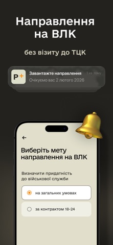
Sampled from 5 of Резерв+'s App Store screenshots — background, accent and theme, measured by LaunchShots (not something Apple publishes).
#24241C bg
#42423B
#7C4C3C accent
#FFFFFF text
Screenshots


Icon palette
About this app
Застосунок Резерв+ від Міністерства оборони України створено для призовників, військовозобов’язаних та резервістів. У ньому можна отримати електронний військово-обліковий документ, подати запит на відстрочку, створити направлення на ВЛК та вибрати свою вакансію у Силах оборони серед тисяч різних варіантів. Щоб згенерувати електронний військово-обліковий документ, необхідно: - Авторизуватися за допомогою BankID; - Внести актуальні контакти: мобільний номер, електронну пошту та адресу проживання. Після цього ви побачите документ у застосунку. Він відображатиме інформацію про вас з реєстру Оберіг — чи є відстрочка, чи маєте порушення правил військового обліку, коли проходили ВЛК тощо. Електронний військово-обліковий документ має таку ж юридичну силу, як паперове тимчасове посвідчення чи приписне. За QR-кодом працівники ТЦК чи поліції зможуть легко перевірити його справжність. У ви…
App details
What you can learn from Резерв+
Every shipping app on the App Store has gone through the same decisions you're working through right now: which screenshot goes first, what caption sits over it, which device frame to show, what color the background should be. The 5 screenshots above are Резерв+'s answers to those questions — they're public, they're real, and they made it through Apple's review.
What the numbers say: Резерв+ runs a dark set with one background colour (#24241C) carried across every screenshot — the listing reads as a single poster when the shots sit side by side in search results. The accent colour we picked up, #7C4C3C, is the one to reuse for badges, arrows and highlighted words if you borrow this look. Hit Use this style to open the editor with these exact colours and drop your own screenshot in.
Notice the first screenshot in particular. It's the one users see in search results and on the product page, and it's where most apps spend their best caption and tightest design. Look at the proportion of background to phone, where the text sits, what one thing the image is trying to communicate.
Want to see how other Utilities apps approach the same problem? Browse more Utilities apps in the showcase.
Take what works into your own screenshots
Open LaunchShots and design your App Store & Google Play screenshots — pick a device frame, drop captions, ship in minutes. Free, in your browser.
Open the screenshot editor →Apps with a similar look
Closest background + accent colours among the listings we've analysed — useful when you want to see the same palette handled by a different team.