Screenshot style breakdown
Sampled from 6 of 時空の駄菓子屋's App Store screenshots — background, accent and theme, measured by LaunchShots (not something Apple publishes).
#B49C94 bg
#9E8982
#7CC4F4 accent
#111111 text
Screenshots

Icon palette
About this app
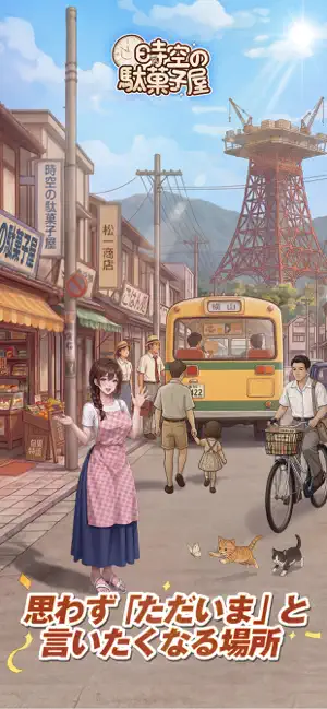
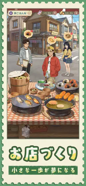
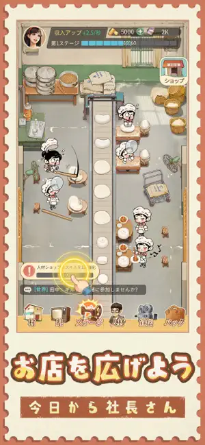
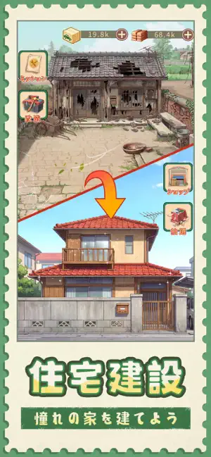
昭和30年代の「幸福町」へ、おかえりなさい。 木造の平屋、路地角の小さなお店、銭湯の煙突、夕暮れの紙芝居屋さん。 そして、学校帰りに空き地で遊ぶ子どもたち―― ここには、どこか懐かしくてあたたかな商店街の時間が流れています。 はじまりは、町の片隅にある小さな雑貨屋さん。 商品を仕入れ、棚に並べ、お客さんを迎えながら、駄菓子屋、喫茶店、貸本屋、レコード店など、昭和の町に欠かせないお店を少しずつ増やしていきましょう。 静かだった通りも、君の商いでだんだんにぎやかになっていきます。 ラムネ、コロッケ、おせんべい、ブリキのおもちゃ…… 懐かしい味や思い出を店先に並べながら、ご近所さんと顔なじみになり、町内会の催しにも参加。 売り買いの中で育まれる、昭和ならではの人情を感じられます。 スマホもインターネットもなかった時代。 けれど、毎日の楽しさはとても身近にありました。 空き地では子どもたちが、めんこ、ビー玉、だるまさんがころんだに夢中。 大人たちは商店街で買い物をし、立ち話をして、喫茶店で…
App details
What you can learn from 時空の駄菓子屋
Every shipping app on the App Store has gone through the same decisions you're working through right now: which screenshot goes first, what caption sits over it, which device frame to show, what color the background should be. The 6 screenshots above are 時空の駄菓子屋's answers to those questions — they're public, they're real, and they made it through Apple's review.
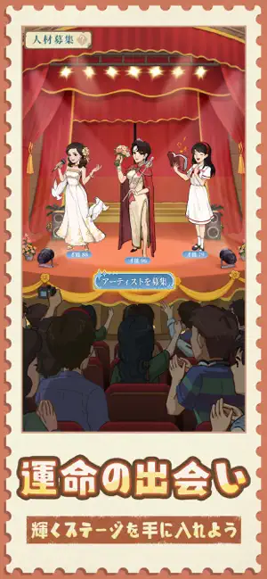
What the numbers say: 時空の駄菓子屋 runs a light set where the background shifts from screenshot to screenshot (first shot #B49C94) — each image has to stand on its own, so the captions carry more of the story. The accent colour we picked up, #7CC4F4, is the one to reuse for badges, arrows and highlighted words if you borrow this look. Hit Use this style to open the editor with these exact colours and drop your own screenshot in.
Notice the first screenshot in particular. It's the one users see in search results and on the product page, and it's where most apps spend their best caption and tightest design. Look at the proportion of background to phone, where the text sits, what one thing the image is trying to communicate.
Want to see how other Games apps approach the same problem? Browse more Games apps in the showcase.
Take what works into your own screenshots
Open LaunchShots and design your App Store & Google Play screenshots — pick a device frame, drop captions, ship in minutes. Free, in your browser.
Open the screenshot editor →Apps with a similar look
Closest background + accent colours among the listings we've analysed — useful when you want to see the same palette handled by a different team.