Chart position — tracked daily by LaunchShots
Screenshot changes — detected by LaunchShots
Screenshot style breakdown
Sampled from 4 of ÜçDörtBeş All Star's App Store screenshots — background, accent and theme, measured by LaunchShots (not something Apple publishes).
#E4E4F4 bg
#C8C8D6
#3474F4 accent
#111111 text
Reading the caption text from the screenshots in your browser…
Screenshots


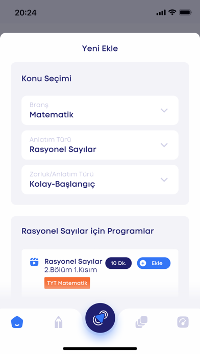
iPad screenshots


Icon palette
About this app
Satın aldığın kitaplardan takip ettiğin konuların videolu konu anlatımlarına ve ödev kitabından çözdüğün ödevler ve denemelerin cevap anahtarlarına uygulamadan erişebilirsin. Platformumuz, öğrencilerin, velilerin ve eğitim kurumlarının ihtiyaçlarını karşılamak üzere tasarlanmıştır. Alanında fenomen ve yetkin hocaların konu anlatımları, seviye tespit sınavları, ÖSYM formatında deneme sınavları, soru çözümleri gibi zengin içeriklerle donatılmıştır. Bu içerikler, öğrencilerin başarılarını artırmak ve öğrenme sürecini desteklemek amacıyla özenle hazırlanmıştır. Platformumuz aynı zamanda velilerin öğrencilerin ilerlemelerini izlemelerine, takip etmelerine olanak tanırken, okullar ve kurslar için özel olarak tasarlanmış ödevlendirme ve takip sistemleri de sunmaktadır. Bu sayede, eğitim sürecini daha verimli ve etkili hale getirmeyi amaçlıyoruz.
App details
What you can learn from ÜçDörtBeş All Star
Every shipping app on the App Store has gone through the same decisions you're working through right now: which screenshot goes first, what caption sits over it, which device frame to show, what color the background should be. The 8 screenshots above are ÜçDörtBeş All Star's answers to those questions — they're public, they're real, and they made it through Apple's review.
What the numbers say: ÜçDörtBeş All Star runs a light set with one background colour (#E4E4F4) carried across every screenshot — the listing reads as a single poster when the shots sit side by side in search results. The accent colour we picked up, #3474F4, is the one to reuse for badges, arrows and highlighted words if you borrow this look. Hit Use this style to open the editor with these exact colours and drop your own screenshot in.
Notice the first screenshot in particular. It's the one users see in search results and on the product page, and it's where most apps spend their best caption and tightest design. Look at the proportion of background to phone, where the text sits, what one thing the image is trying to communicate.
Want to see how other Education apps approach the same problem? Browse more Education apps in the showcase.
Take what works into your own screenshots
Open LaunchShots and design your App Store & Google Play screenshots — pick a device frame, drop captions, ship in minutes. Free, in your browser.
Open the screenshot editor →Apps with a similar look
Closest background + accent colours among the listings we've analysed — useful when you want to see the same palette handled by a different team.