Screenshot style breakdown
Sampled from 3 of 簿記2級 解説付き問題集's App Store screenshots — background, accent and theme, measured by LaunchShots (not something Apple publishes).
#04649C bg
#2779A9
#D45C04 accent
#FFFFFF text
Screenshots
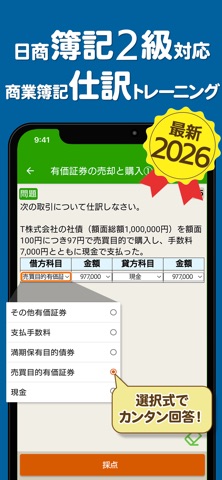
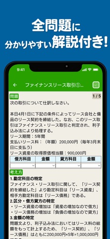

iPad screenshots


Icon palette
About this app
日商簿記2級、商業簿記の仕訳練習アプリの決定版!たっぷり409問題収録で全問題に丁寧な解説付き! チェックを入れた問題を後からまとめて復習できる機能もあります。 資格取得・試験勉強の強い味方。令和8年(2026年)に日商簿記二級の合格を目指すなら、このアプリを今すぐインストール! 本アプリ「簿記2級 解説付き仕訳問題集」は無料ですべてのコンテンツをご利用頂けます。 本アプリは広告ネットワークから配信を受け、アプリ内に広告を表示します。 広告表示が気になる方は、有料となり誠に恐縮ですが、もし宜しければ「本気で学習プラン(広告非表示)」をご利用ください。 利用規約 https://apps.trips.co.jp/terms_of_use.html このアプリ「簿記2級 解説付き問題集 - 仕訳入門や学習法も充実」は、 累計1000万DL、信頼と実績の資格試験対策アプリ「独学TODAY」シリーズのアプリです。 不具合などに気が付かれた方は、アプリ内のお問い合わせからお気軽にご連絡下さい。
App details
What you can learn from 簿記2級 解説付き問題集
Every shipping app on the App Store has gone through the same decisions you're working through right now: which screenshot goes first, what caption sits over it, which device frame to show, what color the background should be. The 6 screenshots above are 簿記2級 解説付き問題集's answers to those questions — they're public, they're real, and they made it through Apple's review.
What the numbers say: 簿記2級 解説付き問題集 runs a dark set with one background colour (#04649C) carried across every screenshot — the listing reads as a single poster when the shots sit side by side in search results. The accent colour we picked up, #D45C04, is the one to reuse for badges, arrows and highlighted words if you borrow this look. Hit Use this style to open the editor with these exact colours and drop your own screenshot in.
Notice the first screenshot in particular. It's the one users see in search results and on the product page, and it's where most apps spend their best caption and tightest design. Look at the proportion of background to phone, where the text sits, what one thing the image is trying to communicate.
Want to see how other Education apps approach the same problem? Browse more Education apps in the showcase.
Take what works into your own screenshots
Open LaunchShots and design your App Store & Google Play screenshots — pick a device frame, drop captions, ship in minutes. Free, in your browser.
Open the screenshot editor →Apps with a similar look
Closest background + accent colours among the listings we've analysed — useful when you want to see the same palette handled by a different team.