Chart position — tracked daily by LaunchShots
Screenshot changes — detected by LaunchShots
Screenshot style breakdown
Sampled from 6 of タイトーステーションアプリ's App Store screenshots — background, accent and theme, measured by LaunchShots (not something Apple publishes).
#E40404 bg
#E72727
#EC5C5C accent
#FFFFFF text
Screenshots



Icon palette
About this app
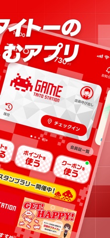
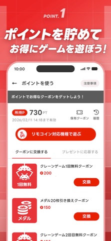
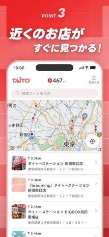
タイトーステーションの 楽しさを最大限に! あなたの毎日をもっとワクワクさせる タイトーステーションアプリが登場! ゲームセンター好きな方必見の、 この無料アプリで、タイトーの世界を もっと身近に、もっと楽しく体験しましょう。 **アプリの魅力** 1. ポイントを貯めて、特典をゲット! - 毎日のログインで、ポイントが どんどん貯まる - お店に行くだけでポイントGet! チェックインが楽しみに - 簡単なミッションをクリアして ポイントをさらにGet! 2. 貯めたポイントで、 特典を手に入れよう!! - クレーンゲームが無料に! お得なクーポンと交換 - 限定プレゼントに応募して ラッキーチャンス! 3. 行きたいお店がすぐ見つかる - GPSを使って近くの店舗を簡単検索 - 最新のプライズ情報やゲーム機種の 情報をいち早くゲット 4. もっと楽しく、もっとお得に - スタンプを集めて、特別な特典をゲット - デジタル会員証で、複数の会員証を このアプリ一つに集約 - 期間限…
App details
What you can learn from タイトーステーションアプリ
Every shipping app on the App Store has gone through the same decisions you're working through right now: which screenshot goes first, what caption sits over it, which device frame to show, what color the background should be. The 7 screenshots above are タイトーステーションアプリ's answers to those questions — they're public, they're real, and they made it through Apple's review.
What the numbers say: タイトーステーションアプリ runs a mixed light-and-dark set where the background shifts from screenshot to screenshot (first shot #E40404) — each image has to stand on its own, so the captions carry more of the story. The accent colour we picked up, #EC5C5C, is the one to reuse for badges, arrows and highlighted words if you borrow this look. Hit Use this style to open the editor with these exact colours and drop your own screenshot in.
Notice the first screenshot in particular. It's the one users see in search results and on the product page, and it's where most apps spend their best caption and tightest design. Look at the proportion of background to phone, where the text sits, what one thing the image is trying to communicate.
Want to see how other Entertainment apps approach the same problem? Browse more Entertainment apps in the showcase.
Take what works into your own screenshots
Open LaunchShots and design your App Store & Google Play screenshots — pick a device frame, drop captions, ship in minutes. Free, in your browser.
Open the screenshot editor →Apps with a similar look
Closest background + accent colours among the listings we've analysed — useful when you want to see the same palette handled by a different team.