Screenshot style breakdown
Sampled from 5 of iPhatNguoi - Tra Phạt Nguội's App Store screenshots — background, accent and theme, measured by LaunchShots (not something Apple publishes).
#CCECD4 bg
#B3CFBA
#2C6C4C accent
#111111 text
Screenshots


iPad screenshots


Icon palette
About this app
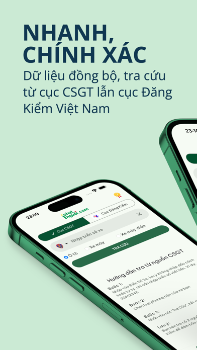
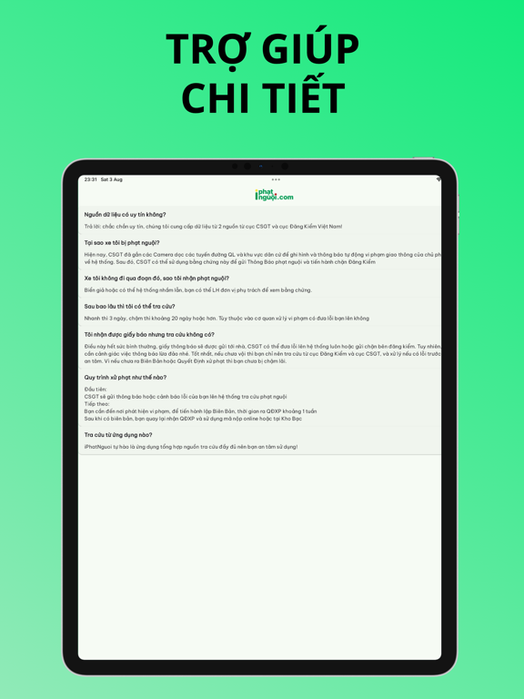
Giới thiệu về iPhatNguoi Kể từ ngày 1/6/2019, CSGT Việt Nam đã công bố rộng rãi về quy trình thông báo và xử lý phạt nguội toàn quốc. Hiện nay tình trạng phương tiện ô tô vi phạm luật giao thông đang có xu hướng gia tăng, chính vì vậy công cụ iPhatNguoi đã ra đời nhằm giúp tháo gỡ khó khăn của tài xế trong việc tra cứu vi phạm Giao Thông. Hiện nay, có 2 nguồn dữ liệu tra cứu vi phạm chính là từ Cục CSGT và cục Đăng Kiểm Việt Nam, để tối ưu và giúp cho tài xế dễ dàng theo dõi một cách chính xác, hay tham khảo hướng dẫn tra cứu bên dưới. Tra Cứu Phạt Nguội từ cục CSGT Bước 1: Chọn loại phương tiện xe của bạn đang sở hữu, ví dụ: chọn xe Ô Tô Bước 2: Bạn nhập biển số xe của bạn tương ứng với loại xe mà bạn chọn. Ví dụ: nhập vào Biển Số 30A12345 Bước 3: Sau khi đã nhập Biển Số Xe của bạn, hãy nhấn vào nút Tra Cứu Ngay lúc bạn nhấn nút Tra Cứu, iPhatNguoi sẽ giúp bạn tìm kiếm phạt nguội th…
App details
What you can learn from iPhatNguoi - Tra Phạt Nguội
Every shipping app on the App Store has gone through the same decisions you're working through right now: which screenshot goes first, what caption sits over it, which device frame to show, what color the background should be. The 8 screenshots above are iPhatNguoi - Tra Phạt Nguội's answers to those questions — they're public, they're real, and they made it through Apple's review.
What the numbers say: iPhatNguoi - Tra Phạt Nguội runs a mixed light-and-dark set where the background shifts from screenshot to screenshot (first shot #CCECD4) — each image has to stand on its own, so the captions carry more of the story. The accent colour we picked up, #2C6C4C, is the one to reuse for badges, arrows and highlighted words if you borrow this look. Hit Use this style to open the editor with these exact colours and drop your own screenshot in.
Notice the first screenshot in particular. It's the one users see in search results and on the product page, and it's where most apps spend their best caption and tightest design. Look at the proportion of background to phone, where the text sits, what one thing the image is trying to communicate.
Want to see how other Navigation apps approach the same problem? Browse more Navigation apps in the showcase.
Take what works into your own screenshots
Open LaunchShots and design your App Store & Google Play screenshots — pick a device frame, drop captions, ship in minutes. Free, in your browser.
Open the screenshot editor →Apps with a similar look
Closest background + accent colours among the listings we've analysed — useful when you want to see the same palette handled by a different team.