Chart position — tracked daily by LaunchShots
Screenshot changes — detected by LaunchShots
Screenshot style breakdown
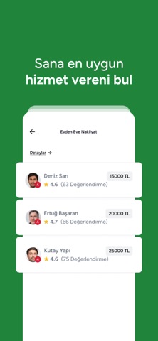
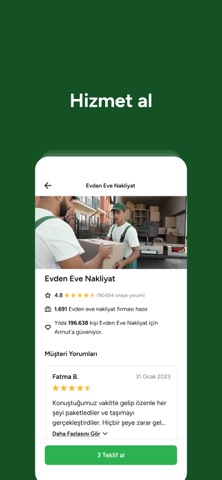
Sampled from 5 of Armut - Hizmet Piş, Ağzıma Düş's App Store screenshots — background, accent and theme, measured by LaunchShots (not something Apple publishes).
#C4F4D4 bg
#ACD6BA
#2C7C44 accent
#111111 text
Screenshots



Icon palette
About this app
"Uygulama çok kullanışlı; temizlik, boya ve nakliye hizmetlerini aldım ve alırken hiç sıkıntı çekmedim. Emeğiniz için çok teşekkürler" Emre A. - App Store yorumu Armut; nakliyat, temizlik, tadilat, boya badana ve özel ders gibi 2000’den fazla kategoride binlerce hizmet verene kolayca ulaşmayı sağlar ve hayatını kolaylaştırır. İyi bir temizlikçi, nakliyeci, elektrik ustası, boyacı ya da matematik özel ders mi arıyorsun? İhtiyacın olan hizmet Türkiye’nin en büyük hizmet platformu Armut’ta! Ev temizliği için temizlikçi bulmak, taşınma işi için nakliye firması bulmak, boya badana için boyacı bulmak ve tadilat işleri için tadilat ustası bulmak Armut ile çok kolay. Aradığın serviste ihtiyacını birkaç soruda anlat. Projene en uygun ve müsait hizmet verenlerden ücretsiz fiyat teklifleri al. Teklif verenlerin önceki işlerini incele, gerçek müşteri yorumlarını oku. Beğendiğin ve çalışmak iste…
App details
What you can learn from Armut - Hizmet Piş, Ağzıma Düş
Every shipping app on the App Store has gone through the same decisions you're working through right now: which screenshot goes first, what caption sits over it, which device frame to show, what color the background should be. The 5 screenshots above are Armut - Hizmet Piş, Ağzıma Düş's answers to those questions — they're public, they're real, and they made it through Apple's review.
What the numbers say: Armut - Hizmet Piş, Ağzıma Düş runs a mixed light-and-dark set where the background shifts from screenshot to screenshot (first shot #C4F4D4) — each image has to stand on its own, so the captions carry more of the story. The accent colour we picked up, #2C7C44, is the one to reuse for badges, arrows and highlighted words if you borrow this look. Hit Use this style to open the editor with these exact colours and drop your own screenshot in.
Notice the first screenshot in particular. It's the one users see in search results and on the product page, and it's where most apps spend their best caption and tightest design. Look at the proportion of background to phone, where the text sits, what one thing the image is trying to communicate.
Want to see how other Lifestyle apps approach the same problem? Browse more Lifestyle apps in the showcase.
Take what works into your own screenshots
Open LaunchShots and design your App Store & Google Play screenshots — pick a device frame, drop captions, ship in minutes. Free, in your browser.
Open the screenshot editor →Apps with a similar look
Closest background + accent colours among the listings we've analysed — useful when you want to see the same palette handled by a different team.