Chart position — tracked daily by LaunchShots
Screenshot style breakdown
Sampled from 6 of حكاوي - روايات وقصص بدون نت's App Store screenshots — background, accent and theme, measured by LaunchShots (not something Apple publishes).
#1C0C04 bg
#3B2E27
#6C3C14 accent
#FFFFFF text
Screenshots


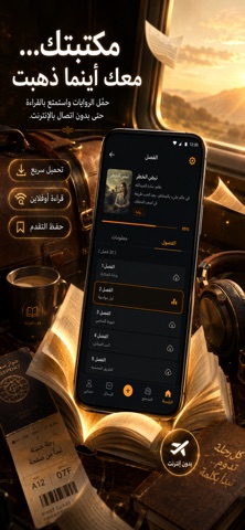


iPad screenshots


Icon palette
About this app
حكاوي — مكتبة روايات وقصص وكتب عربية، تقرأها بدون إنترنت. روايات وقصص وكتب عربية في تطبيق واحد. احفظ ما تحب على جهازك، واقرأه في أي وقت وأي مكان: في المترو، في الطائرة، في الانتظار، أو حيث لا تصل الشبكة. ■ قراءة بدون نت (أوفلاين) ما تحفظه يبقى على جهازك. لا انقطاع أثناء القراءة، ولا استهلاك لباقة الإنترنت. ■ مكتبة عربية متنوّعة روايات رومانسية، وروايات رعب وغموض، وروايات بوليسية، وروايات تاريخية، وخيال علمي، وأدب كلاسيكي، وقصص قصيرة. ■ قارئ كتب مريح لعينيك وضع ليلي للقراءة في الظلام، وتحكّم كامل في حجم الخط ونوعه، وحفظ تلقائي لآخر صفحة وصلت إليها، وعلامات مرجعية لأي فقرة تحب العودة إليها. ■ رتّب مكتبتك أضف ما يعجبك إلى قائمة القراءة، وتابع تقدّمك في كل رواية، وارجع إلى ما توقّفت عنده بضغطة واحدة. ■ مجتمع قرّاء عربي ناقش الروايات مع قرّاء آخرين، وانضم إلى غرفة نقاش خاصة بكل رواية، واكتب رأيك، وتابع من تحب. يمكنك الإبلاغ عن أي محتوى مخالف وحظر أي مستخدم، ونراجع البلاغات ونحذف المحتو…
App details
What you can learn from حكاوي - روايات وقصص بدون نت
Every shipping app on the App Store has gone through the same decisions you're working through right now: which screenshot goes first, what caption sits over it, which device frame to show, what color the background should be. The 13 screenshots above are حكاوي - روايات وقصص بدون نت's answers to those questions — they're public, they're real, and they made it through Apple's review.
What the numbers say: حكاوي - روايات وقصص بدون نت runs a dark set with one background colour (#1C0C04) carried across every screenshot — the listing reads as a single poster when the shots sit side by side in search results. The accent colour we picked up, #6C3C14, is the one to reuse for badges, arrows and highlighted words if you borrow this look. Hit Use this style to open the editor with these exact colours and drop your own screenshot in.
Notice the first screenshot in particular. It's the one users see in search results and on the product page, and it's where most apps spend their best caption and tightest design. Look at the proportion of background to phone, where the text sits, what one thing the image is trying to communicate.
Want to see how other Book apps approach the same problem? Browse more Book apps in the showcase.
Take what works into your own screenshots
Open LaunchShots and design your App Store & Google Play screenshots — pick a device frame, drop captions, ship in minutes. Free, in your browser.
Open the screenshot editor →Apps with a similar look
Closest background + accent colours among the listings we've analysed — useful when you want to see the same palette handled by a different team.