Chart position — tracked daily by LaunchShots
Screenshot changes — detected by LaunchShots
Screenshot style breakdown
Sampled from 6 of Алиса AI: Нейросеть Яндекса's App Store screenshots — background, accent and theme, measured by LaunchShots (not something Apple publishes).
#C4CCDC bg
#ACB3C1
#5484FC accent
#111111 text
- #1Самая мощная нейросеть Яндекса для реальных задач
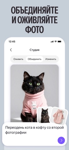
- #2ОБЪЕДИНЯЙТЕ И ОЖИВЛЯЙТЕ ФОТО
- #3ЗАДАВАЙТЕ СЛОЖНЫЕ ВОПРОСЫ
- #4ЗАПУСКАЙТЕ ИССЛЕДОВАНИЯ
- #5ПОГРУЖАЙТЕСЬ ВТЕМУ
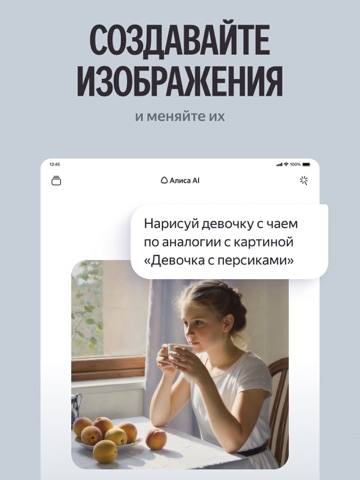
- #6СОЗДАВАЙТЕ ИЗОБРАЖЕНИЯ
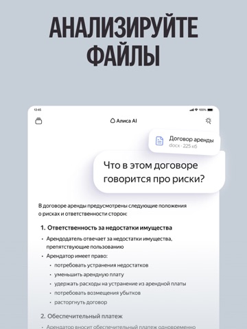
Captions read from the screenshots (OCR, may contain small errors): 6 headlines, 3.3 words on average (longest 7), mostly ALL CAPS.
Screenshots



iPad screenshots


Icon palette
About this app
Алиса AI: тексты, нейросеть, новые идеи, знания, ИИ чат на русском. Широкие возможности, которые предлагает искусственный интеллект (ИИ, AI) от Яндекса в вашем смартфоне: помощь с рутинными делами, решение задач для учёбы, работы и творчества. Оцените возможности нейросети с Алисой — всё, что вы ждёте от умного чата на русском. Alice AI — семейство генеративных моделей Яндекса, на основе которых работает Алиса. В него входят: - Alice AI LLM — языковая модель, которая позволяет отвечать на вопросы и генерировать тексты; - Alice AI ART — картиночная модель, которая генерирует изображения; - Alice AI VLM — мультимодальная визуально-языковая модель для анализирования изображений, ответов на вопросы и решения задач, связанных с этими изображениями. Задавайте вопросы, пишите и редактируйте тексты — нейросеть Алиса AI точно и полно ответит, дополнив свой ответ картинками и ссылками на ист…
App details
What you can learn from Алиса AI: Нейросеть Яндекса
Every shipping app on the App Store has gone through the same decisions you're working through right now: which screenshot goes first, what caption sits over it, which device frame to show, what color the background should be. The 14 screenshots above are Алиса AI: Нейросеть Яндекса's answers to those questions — they're public, they're real, and they made it through Apple's review.
What the numbers say: Алиса AI: Нейросеть Яндекса runs a light set with one background colour (#C4CCDC) carried across every screenshot — the listing reads as a single poster when the shots sit side by side in search results. The accent colour we picked up, #5484FC, is the one to reuse for badges, arrows and highlighted words if you borrow this look. Hit Use this style to open the editor with these exact colours and drop your own screenshot in.
Notice the first screenshot in particular. It's the one users see in search results and on the product page, and it's where most apps spend their best caption and tightest design. Look at the proportion of background to phone, where the text sits, what one thing the image is trying to communicate.
Want to see how other Productivity apps approach the same problem? Browse more Productivity apps in the showcase.
Take what works into your own screenshots
Open LaunchShots and design your App Store & Google Play screenshots — pick a device frame, drop captions, ship in minutes. Free, in your browser.
Open the screenshot editor →Apps with a similar look
Closest background + accent colours among the listings we've analysed — useful when you want to see the same palette handled by a different team.