Chart position — tracked daily by LaunchShots
Screenshot style breakdown
Sampled from 6 of Daleel Aqar-دليل عقار's App Store screenshots — background, accent and theme, measured by LaunchShots (not something Apple publishes).
#FCFCFC bg
#DDDDDD
#1C3474 accent
#111111 text
Reading the caption text from the screenshots in your browser…
Screenshots

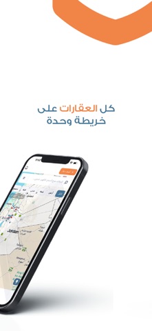
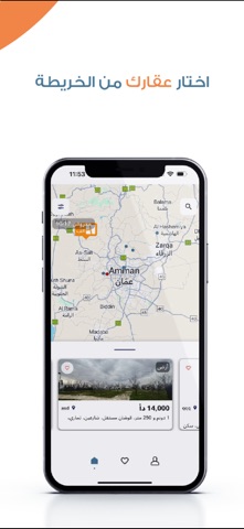


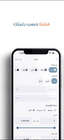
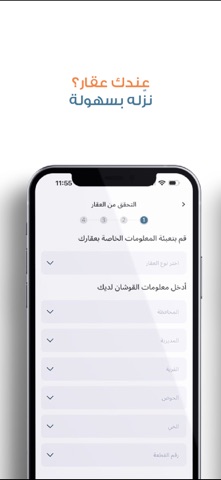
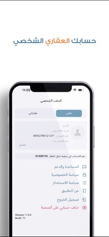
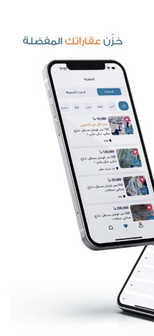
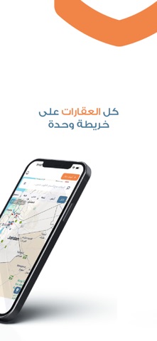
iPad screenshots


Icon palette
About this app
دليل عقار (Daleel Aqar) هو تطبيق عقاري مبتكر في الأردن يهدف إلى تسهيل عمليات البيع والشراء من خلال منصة ذكية توفر للمستخدمين تجربة بحث دقيقة ومتكاملة. يتيح التطبيق للملاك، الوسطاء، والمندوبين العقاريين إضافة العقارات بسهولة، مع دعم خيارات بحث متقدمة تشمل الأراضي، الشقق، المنازل، الفلل، المباني، المزارع، المصانع، والمزيد. مميزات التطبيق: - عقارات موثوقة ومنظمة – تصفح عقارات حقيقية غير مكررة، مع بيانات دقيقة، مواقع محددة، وأسعار واضحة. - إضافة وإدارة العقارات بسهولة – أضف عقارك مع الصور، الفيديوهات، والمواصفات والتفاصيل الدقيقة، وتابع استفسارات المهتمين مباشرة. - بحث وفلترة متقدمة – ابحث عن العقارات حسب الموقع، السعر، المساحة، نوع العقار، والمواصفات للحصول على نتائج دقيقة. - خريطة تفاعلية للعقارات – اكتشف العقارات على الخريطة وابحث بسهولة حسب المناطق والمواقع القريبة. عقارات لأجلك – احصل على اقتراحات عقارية مخصصة بناءً على اهتماماتك وموقعك لتجد العقارات المناسبة لك بسهولة. ترتيب ال…
App details
What you can learn from Daleel Aqar-دليل عقار
Every shipping app on the App Store has gone through the same decisions you're working through right now: which screenshot goes first, what caption sits over it, which device frame to show, what color the background should be. The 19 screenshots above are Daleel Aqar-دليل عقار's answers to those questions — they're public, they're real, and they made it through Apple's review.
What the numbers say: Daleel Aqar-دليل عقار runs a light set with one background colour (#FCFCFC) carried across every screenshot — the listing reads as a single poster when the shots sit side by side in search results. The accent colour we picked up, #1C3474, is the one to reuse for badges, arrows and highlighted words if you borrow this look. Hit Use this style to open the editor with these exact colours and drop your own screenshot in.
Notice the first screenshot in particular. It's the one users see in search results and on the product page, and it's where most apps spend their best caption and tightest design. Look at the proportion of background to phone, where the text sits, what one thing the image is trying to communicate.
Want to see how other Lifestyle apps approach the same problem? Browse more Lifestyle apps in the showcase.
Take what works into your own screenshots
Open LaunchShots and design your App Store & Google Play screenshots — pick a device frame, drop captions, ship in minutes. Free, in your browser.
Open the screenshot editor →Apps with a similar look
Closest background + accent colours among the listings we've analysed — useful when you want to see the same palette handled by a different team.