Screenshot changes — detected by LaunchShots
Screenshot style breakdown
Sampled from 6 of プロサッカークラブをつくろう!'s App Store screenshots — background, accent and theme, measured by LaunchShots (not something Apple publishes).
#040434 bg
#272750
#0C3C84 accent
#FFFFFF text
Screenshots


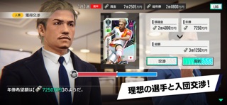

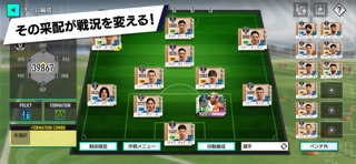
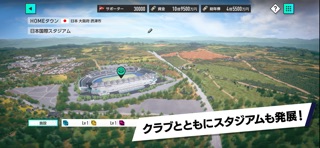
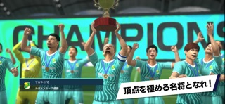
iPad screenshots


Icon palette
About this app
大人気サッカークラブ経営シミュレーションゲーム『サカつく』が、ついにかえってきた。 サッカーを愛するすべての人へ。クラブ経営の醍醐味、選手育成の楽しさ、監督として戦術を組み立てる奥深さを兼ね備えた本格サッカーゲームが、スマートフォンでいつでもどこでも楽しめる。 Jリーグ(J1・J2・J3)をはじめ、世界各国のリーグやクラブを舞台に、さまざまなサッカー文化を感じながら、自分だけのクラブを世界の頂点へ導こう。 J1・J2・J3全60クラブの公式ライセンスを取得。実在クラブ、実在選手とともに戦える本格サッカーシミュレーションゲームの決定版。 サカつくでは基本プレイ無料で楽しめるだけでなく、クロスプラットフォーム・クロスプレイにも対応。スマートフォン、PC、コンソールを問わず、世界中のサッカーファンと同じ舞台で競い合うことができる。 サッカー愛こそ全ての原点。『プロサッカークラブをつくろう!』シリーズの伝統を受け継ぎながら、さらなる進化を遂げた最新の本格サッカーゲームを体験しよう。 ■大人気サッカーシミュレーション…
App details
What you can learn from プロサッカークラブをつくろう!
Every shipping app on the App Store has gone through the same decisions you're working through right now: which screenshot goes first, what caption sits over it, which device frame to show, what color the background should be. The 16 screenshots above are プロサッカークラブをつくろう!'s answers to those questions — they're public, they're real, and they made it through Apple's review.
What the numbers say: プロサッカークラブをつくろう! runs a dark set where the background shifts from screenshot to screenshot (first shot #040434) — each image has to stand on its own, so the captions carry more of the story. The accent colour we picked up, #0C3C84, is the one to reuse for badges, arrows and highlighted words if you borrow this look. Hit Use this style to open the editor with these exact colours and drop your own screenshot in.
Notice the first screenshot in particular. It's the one users see in search results and on the product page, and it's where most apps spend their best caption and tightest design. Look at the proportion of background to phone, where the text sits, what one thing the image is trying to communicate.
Want to see how other Games apps approach the same problem? Browse more Games apps in the showcase.
Take what works into your own screenshots
Open LaunchShots and design your App Store & Google Play screenshots — pick a device frame, drop captions, ship in minutes. Free, in your browser.
Open the screenshot editor →Apps with a similar look
Closest background + accent colours among the listings we've analysed — useful when you want to see the same palette handled by a different team.