Chart position — tracked daily by LaunchShots
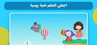
Screenshot style breakdown
Sampled from 4 of تعليم الحروف والكلمات والنطق's App Store screenshots — background, accent and theme, measured by LaunchShots (not something Apple publishes).
#E4ACFC bg
#C897DD
#8C54FC accent
#111111 text
Reading the caption text from the screenshots in your browser…
Screenshots


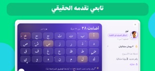
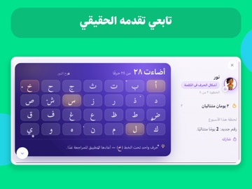
iPad screenshots


Icon palette
About this app
من أول حرف… إلى أن يبدأ طفلك بالقراءة بنفسه. حروف نور هو تطبيق عربي يساعد طفلك على تعلم القراءة خطوة بخطوة، من معرفة الحروف وتمييزها، إلى دمج الأصوات وقراءة الكلمات، ثم التدرّب على القراءة بشكل أسرع وأسهل والاستمتاع بالقصص. بدل أن يحفظ الطفل الحروف فقط، يتدرج معه حروف نور في رحلة قراءة واضحة، وكل مرحلة تجهزه للمرحلة التي بعدها. ماذا سيتعلم طفلك؟ • تعلم الحروف العربية والتعرف عليها وتمييزها • أصوات الحروف وربط الحرف بصوته • تعليم الحروف من خلال ألعاب وتمارين تفاعلية • دمج الحروف والأصوات لتكوين الكلمات • قراءة الكلمات تدريجيًا بدون الاعتماد على التهجئة في كل مرة • التدريب على القراءة بشكل أسرع وأكثر تلقائية • قراءة القصص والتفاعل معها • مراجعة ما تعلمه بطريقة ممتعة تساعده على التذكر حروف نور مناسب للأطفال في مرحلة الروضة والتمهيدي والسنوات الأولى، سواء كان طفلك يبدأ من أول حرف أو يعرف الحروف ومستعد للانتقال إلى الكلمات والقراءة. صممنا التجربة لتجعل تعليم الاطفال القراءة أبسط وأكثر …
App details
What you can learn from تعليم الحروف والكلمات والنطق
Every shipping app on the App Store has gone through the same decisions you're working through right now: which screenshot goes first, what caption sits over it, which device frame to show, what color the background should be. The 8 screenshots above are تعليم الحروف والكلمات والنطق's answers to those questions — they're public, they're real, and they made it through Apple's review.
What the numbers say: تعليم الحروف والكلمات والنطق runs a light set where the background shifts from screenshot to screenshot (first shot #E4ACFC) — each image has to stand on its own, so the captions carry more of the story. The accent colour we picked up, #8C54FC, is the one to reuse for badges, arrows and highlighted words if you borrow this look. Hit Use this style to open the editor with these exact colours and drop your own screenshot in.
Notice the first screenshot in particular. It's the one users see in search results and on the product page, and it's where most apps spend their best caption and tightest design. Look at the proportion of background to phone, where the text sits, what one thing the image is trying to communicate.
Want to see how other Education apps approach the same problem? Browse more Education apps in the showcase.
Take what works into your own screenshots
Open LaunchShots and design your App Store & Google Play screenshots — pick a device frame, drop captions, ship in minutes. Free, in your browser.
Open the screenshot editor →Apps with a similar look
Closest background + accent colours among the listings we've analysed — useful when you want to see the same palette handled by a different team.