Chart position — tracked daily by LaunchShots
Screenshot changes — detected by LaunchShots
Screenshot style breakdown
Sampled from 6 of Nubank: Conta, Cartão e mais's App Store screenshots — background, accent and theme, measured by LaunchShots (not something Apple publishes).
#D4A4FC bg
#BA90DD
#A444F4 accent
#111111 text
Screenshots





Icon palette
About this app
O Nubank nasceu para acabar com a complexidade dos bancos tradicionais e devolver o controle da vida financeira nas mãos de cada um. Somos o maior banco digital da América Latina. E é por isso que nosso aplicativo foi criado para refletir tudo no que acreditamos. Com ele, você tem uma experiência transparente, simples e justa. Como sempre deveria ser. Uma experiência que fica mais completa por usarmos tecnologia própria. Assim, além de estar mais seguro, você pode estar sempre no controle de tudo. Controlando gastos, transações, transferências, pagamentos e cobranças de forma intuitiva e integrada. Sem pegadinhas, tarifas inexplicáveis e sem nenhum asterisco para dizer o contrário. E para você que ainda está lendo essa descrição, uma lista especial de descomplicações para quem escolhe ser Nu: - NuConta gratuita - Atendimento humano e focado no que é melhor para você - Cartão de cr…
App details
What you can learn from Nubank: Conta, Cartão e mais
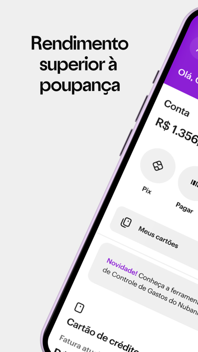
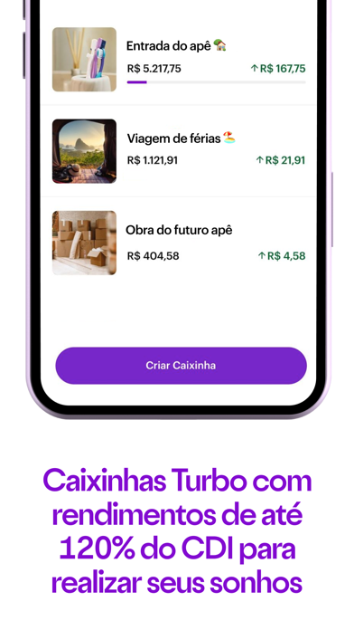
Every shipping app on the App Store has gone through the same decisions you're working through right now: which screenshot goes first, what caption sits over it, which device frame to show, what color the background should be. The 8 screenshots above are Nubank: Conta, Cartão e mais's answers to those questions — they're public, they're real, and they made it through Apple's review.
What the numbers say: Nubank: Conta, Cartão e mais runs a light set where the background shifts from screenshot to screenshot (first shot #D4A4FC) — each image has to stand on its own, so the captions carry more of the story. The accent colour we picked up, #A444F4, is the one to reuse for badges, arrows and highlighted words if you borrow this look. Hit Use this style to open the editor with these exact colours and drop your own screenshot in.
Notice the first screenshot in particular. It's the one users see in search results and on the product page, and it's where most apps spend their best caption and tightest design. Look at the proportion of background to phone, where the text sits, what one thing the image is trying to communicate.
Want to see how other Finance apps approach the same problem? Browse more Finance apps in the showcase.
Take what works into your own screenshots
Open LaunchShots and design your App Store & Google Play screenshots — pick a device frame, drop captions, ship in minutes. Free, in your browser.
Open the screenshot editor →Apps with a similar look
Closest background + accent colours among the listings we've analysed — useful when you want to see the same palette handled by a different team.