Chart position — tracked daily by LaunchShots
Screenshot changes — detected by LaunchShots
Screenshot style breakdown
Sampled from 6 of ПОБЕДА честных цен's App Store screenshots — background, accent and theme, measured by LaunchShots (not something Apple publishes).
#54B454 bg
#499E49
#E40C04 accent
#111111 text
Screenshots



Icon palette
About this app
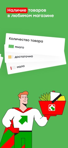
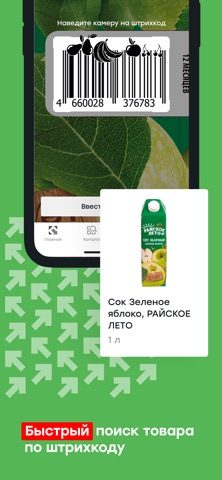
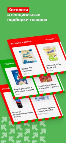
Мобильное приложение магазинов честных цен ПОБЕДА — удобные покупки с максимальной выгодой! Приложение дискаунтеров ПОБЕДА — надежный помощник в мире низких цен и выгодных предложений! Мы стремимся сделать процесс покупок максимально простым и комфортным, и наше приложение создано именно для этого. Скачивайте и получайте доступ к тысячам товаров по честным ценам, а также полезным функциям и специальным предложениям. В нашем приложении вы найдете: Удобный поиск и выбор товаров • Каталог с актуальными ценами — легко находите необходимые продукты и товары. • Сканер штрих-кода — мгновенно проверяйте цены и наличие товара в магазине. • Фильтры и категории — быстро ориентируйтесь в ассортименте магазина. • Проверка наличия — узнайте, есть ли товар в ближайшем магазине и сколько единиц осталось. Специальные предложения и новинки • Выгодные предложения — будьте в курсе всех акций и новинок. Пол…
App details
What you can learn from ПОБЕДА честных цен
Every shipping app on the App Store has gone through the same decisions you're working through right now: which screenshot goes first, what caption sits over it, which device frame to show, what color the background should be. The 7 screenshots above are ПОБЕДА честных цен's answers to those questions — they're public, they're real, and they made it through Apple's review.
What the numbers say: ПОБЕДА честных цен runs a light set with one background colour (#54B454) carried across every screenshot — the listing reads as a single poster when the shots sit side by side in search results. The accent colour we picked up, #E40C04, is the one to reuse for badges, arrows and highlighted words if you borrow this look. Hit Use this style to open the editor with these exact colours and drop your own screenshot in.
Notice the first screenshot in particular. It's the one users see in search results and on the product page, and it's where most apps spend their best caption and tightest design. Look at the proportion of background to phone, where the text sits, what one thing the image is trying to communicate.
Want to see how other Food & Drink apps approach the same problem? Browse more Food & Drink apps in the showcase.
Take what works into your own screenshots
Open LaunchShots and design your App Store & Google Play screenshots — pick a device frame, drop captions, ship in minutes. Free, in your browser.
Open the screenshot editor →Apps with a similar look
Closest background + accent colours among the listings we've analysed — useful when you want to see the same palette handled by a different team.