Chart position — tracked daily by LaunchShots
Screenshot style breakdown
Sampled from 4 of Depremix - Anlık Deprem Uyarı's App Store screenshots — background, accent and theme, measured by LaunchShots (not something Apple publishes).
#CC1C1C bg
#D33B3B
#740C0C accent
#FFFFFF text
Reading the caption text from the screenshots in your browser…
Screenshots
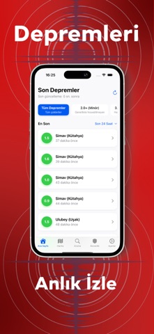
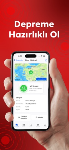
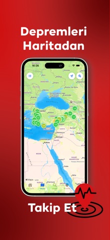

iPad screenshots


Icon palette
About this app
Türkiye ve yakın çevredeki depremleri AFAD verisiyle anında öğrenin. Kişiselleştirilebilir bildirimler, interaktif harita, güvenlik rehberi ve acil durum araçları tek uygulamada. Depremix, Türkiye ve çevresindeki depremleri gerçek zamanlı izleyip önemli sarsıntıları kaçırmamanız için tasarlandı. AFAD’ın sağladığı güncel verileri tek ekranda toplayarak; anlık bildirim, detaylı deprem bilgisi, interaktif harita ve güvenlik rehberi ile her an hazırlıklı kalmanıza yardımcı olur. Neden Depremix? (Fayda Odaklı) İlk siz öğrenin: Önemli depremler anında bildirim olarak gelsin. Sadece ilgilendirenleri görün: Minimum büyüklük filtresi ve kişiselleştirilebilir ayarlar. Daha bilinçli karar verin: Şiddet/etki analizi, geçmiş ve istatistiklerle tabloyu görün. Ailenizle hazırlıklı olun: Güvenlik rehberi ve acil durum araçları her zaman elinizde. Özellikler Anlık Deprem Bildirimleri AFAD kayna…
App details
What you can learn from Depremix - Anlık Deprem Uyarı
Every shipping app on the App Store has gone through the same decisions you're working through right now: which screenshot goes first, what caption sits over it, which device frame to show, what color the background should be. The 8 screenshots above are Depremix - Anlık Deprem Uyarı's answers to those questions — they're public, they're real, and they made it through Apple's review.
What the numbers say: Depremix - Anlık Deprem Uyarı runs a dark set with one background colour (#CC1C1C) carried across every screenshot — the listing reads as a single poster when the shots sit side by side in search results. The accent colour we picked up, #740C0C, is the one to reuse for badges, arrows and highlighted words if you borrow this look. Hit Use this style to open the editor with these exact colours and drop your own screenshot in.
Notice the first screenshot in particular. It's the one users see in search results and on the product page, and it's where most apps spend their best caption and tightest design. Look at the proportion of background to phone, where the text sits, what one thing the image is trying to communicate.
Want to see how other Weather apps approach the same problem? Browse more Weather apps in the showcase.
Take what works into your own screenshots
Open LaunchShots and design your App Store & Google Play screenshots — pick a device frame, drop captions, ship in minutes. Free, in your browser.
Open the screenshot editor →Apps with a similar look
Closest background + accent colours among the listings we've analysed — useful when you want to see the same palette handled by a different team.