Chart position — tracked daily by LaunchShots
Screenshot changes — detected by LaunchShots
Screenshot style breakdown
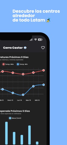
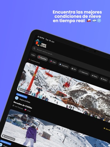
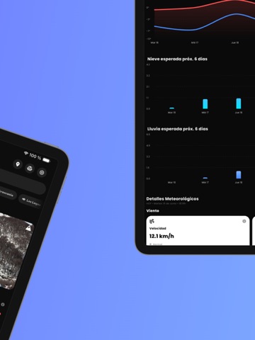
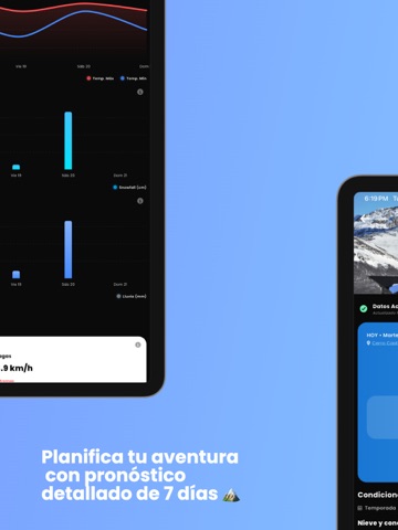
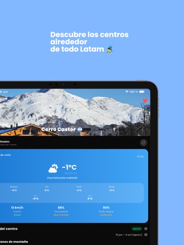
Sampled from 5 of SnowLatam's App Store screenshots — background, accent and theme, measured by LaunchShots (not something Apple publishes).
#6C74FC bg
#8087FC
#1C6CA4 accent
#FFFFFF text
Reading the caption text from the screenshots in your browser…
Screenshots
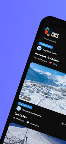
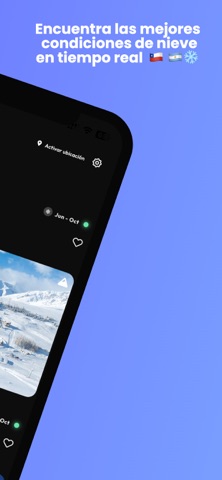
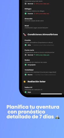
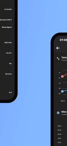
iPad screenshots
Icon palette
About this app
La app definitiva para los amantes de la nieve en Latinoamérica Descubre las mejores condiciones de nieve en tiempo real para planificar tu próxima aventura en las montañas de Chile y Argentina. SnowLatam te conecta con más de 28 centros de esquí desde los Andes chilenos hasta la Patagonia argentina. CARACTERÍSTICAS PRINCIPALES: Clima en Tiempo Real - Temperatura, viento, humedad y condiciones actualizadas cada minuto Pronóstico 7 Días - Planifica con anticipación tus escapadas a la nieve 28+ Centros de Esquí - Cobertura completa en Chile y Argentina Geolocalización - Encuentra el centro más cercano a ti en ambos países Favoritos - Guarda tus centros preferidos Historial Meteorológico - Analiza tendencias y patrones del clima INFORMACIÓN DETALLADA: Temperaturas por períodos (mañana, día, tarde, noche) Velocidad y dirección del viento Probabilidad de nieve y precipitación Índice UV y vis…
App details
What you can learn from SnowLatam
Every shipping app on the App Store has gone through the same decisions you're working through right now: which screenshot goes first, what caption sits over it, which device frame to show, what color the background should be. The 9 screenshots above are SnowLatam's answers to those questions — they're public, they're real, and they made it through Apple's review.
What the numbers say: SnowLatam runs a mixed light-and-dark set where the background shifts from screenshot to screenshot (first shot #6C74FC) — each image has to stand on its own, so the captions carry more of the story. The accent colour we picked up, #1C6CA4, is the one to reuse for badges, arrows and highlighted words if you borrow this look. Hit Use this style to open the editor with these exact colours and drop your own screenshot in.
Notice the first screenshot in particular. It's the one users see in search results and on the product page, and it's where most apps spend their best caption and tightest design. Look at the proportion of background to phone, where the text sits, what one thing the image is trying to communicate.
Want to see how other Weather apps approach the same problem? Browse more Weather apps in the showcase.
Take what works into your own screenshots
Open LaunchShots and design your App Store & Google Play screenshots — pick a device frame, drop captions, ship in minutes. Free, in your browser.
Open the screenshot editor →Apps with a similar look
Closest background + accent colours among the listings we've analysed — useful when you want to see the same palette handled by a different team.