Screenshot changes — detected by LaunchShots
Screenshot style breakdown
Sampled from 4 of 東京個別・関西個別生徒用アプリ's App Store screenshots — background, accent and theme, measured by LaunchShots (not something Apple publishes).
#FCFCFC bg
#DDDDDD
#043C84 accent
#111111 text
Screenshots


iPad screenshots


Icon palette
About this app
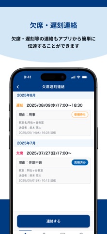
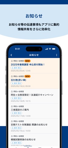
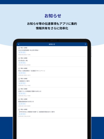
東京個別指導学院 公式アプリ 「もっと身近に、もっとスムーズに」 生徒・保護者・講師の声から生まれた、学習サポートアプリです。 日々の通塾がもっと便利に、もっと安心に変わります。 ――――――――――――――― ◆ 主な機能 【お知らせ】 教室からの連絡事項をアプリで確認。 プリントの見落としや紛失を防ぎ、情報をスムーズに共有できます。 【入退室通知】 教室への入退室をアプリで記録し、保護者へプッシュ通知を自動で送信。 お子様の通塾状況をリアルタイムで把握できるから、安心です。 【欠席・遅刻連絡】 急な欠席や遅刻も、アプリから教室へ簡単に連絡。 電話の手間を省き、いつでもどこでもスマートに対応できます。 ――――――――――――――― 東京個別の個別指導が、もっと近くに 保護者の方との連携もスムーズにし、お子様の学習を全力でサポートします。 東京個別指導学院アプリで、より充実した学びの時間をお過ごしください。 ※一部機能は校舎により異なる場合があります。 ※保護者・生徒で利用できる機能に違いがある場合があります。
App details
What you can learn from 東京個別・関西個別生徒用アプリ
Every shipping app on the App Store has gone through the same decisions you're working through right now: which screenshot goes first, what caption sits over it, which device frame to show, what color the background should be. The 8 screenshots above are 東京個別・関西個別生徒用アプリ's answers to those questions — they're public, they're real, and they made it through Apple's review.
What the numbers say: 東京個別・関西個別生徒用アプリ runs a light set with one background colour (#FCFCFC) carried across every screenshot — the listing reads as a single poster when the shots sit side by side in search results. The accent colour we picked up, #043C84, is the one to reuse for badges, arrows and highlighted words if you borrow this look. Hit Use this style to open the editor with these exact colours and drop your own screenshot in.
Notice the first screenshot in particular. It's the one users see in search results and on the product page, and it's where most apps spend their best caption and tightest design. Look at the proportion of background to phone, where the text sits, what one thing the image is trying to communicate.
Want to see how other Education apps approach the same problem? Browse more Education apps in the showcase.
Take what works into your own screenshots
Open LaunchShots and design your App Store & Google Play screenshots — pick a device frame, drop captions, ship in minutes. Free, in your browser.
Open the screenshot editor →Apps with a similar look
Closest background + accent colours among the listings we've analysed — useful when you want to see the same palette handled by a different team.