Chart position — tracked daily by LaunchShots
Screenshot changes — detected by LaunchShots
Screenshot style breakdown
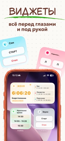
Sampled from 5 of Дневник Малыша: AnaBaby's App Store screenshots — background, accent and theme, measured by LaunchShots (not something Apple publishes).
#FCFCF4 bg
#DDDDD6
#FC9474 accent
#111111 text
Screenshots




Icon palette
About this app
«Дневник Малыша: AnaBaby» — это ваш идеальный трекер новорожденного и незаменимый карманный помощник в материнстве. Мы объединили всё, что нужно современной маме, в простой, уютный и понятный интерфейс. Больше не нужно скачивать 5 разных программ. Одно приложение для сна, другое как календарь прививок, третье для первого прикорма? Забудьте! Теперь весь уход за младенцем под контролем в одном месте. • Облачная синхронизация и Семейный доступ - Объединяйте любые устройства в одну семью: все таймеры и события обновляются на всех устройствах в реальном времени. - Два уровня прав: Администратор (для совместного ведения записей) и Гость (режим только для просмотра — идеально для педиатров, консультантов по сну). • Окно в сон: Укладывание без слез - Умный алгоритм: анализирует историю вашего малыша и предсказывает идеальное время для отдыха и пробуждения. - Подсказки по фазам: система вов…
App details
What you can learn from Дневник Малыша: AnaBaby
Every shipping app on the App Store has gone through the same decisions you're working through right now: which screenshot goes first, what caption sits over it, which device frame to show, what color the background should be. The 5 screenshots above are Дневник Малыша: AnaBaby's answers to those questions — they're public, they're real, and they made it through Apple's review.
What the numbers say: Дневник Малыша: AnaBaby runs a light set with one background colour (#FCFCF4) carried across every screenshot — the listing reads as a single poster when the shots sit side by side in search results. The accent colour we picked up, #FC9474, is the one to reuse for badges, arrows and highlighted words if you borrow this look. Hit Use this style to open the editor with these exact colours and drop your own screenshot in.
Notice the first screenshot in particular. It's the one users see in search results and on the product page, and it's where most apps spend their best caption and tightest design. Look at the proportion of background to phone, where the text sits, what one thing the image is trying to communicate.
Want to see how other Medical apps approach the same problem? Browse more Medical apps in the showcase.
Take what works into your own screenshots
Open LaunchShots and design your App Store & Google Play screenshots — pick a device frame, drop captions, ship in minutes. Free, in your browser.
Open the screenshot editor →Apps with a similar look
Closest background + accent colours among the listings we've analysed — useful when you want to see the same palette handled by a different team.