Screenshot style breakdown
Sampled from 6 of VNPT Elearning Enterprise V2's App Store screenshots — background, accent and theme, measured by LaunchShots (not something Apple publishes).
#FCFCFC bg
#DDDDDD
#2474DC accent
#111111 text
- #22 Khéa hoc Cuộc thi Khảo sát Kho học liệu Kho tài liệu Kế hoạch
- #32 Khóa học hoàn thiện Khóa các bài giảng kỹ năng cơ bản... TT3 xây dựng hoàn... § 10:00 04
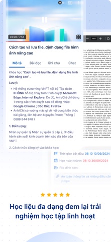
- #4@ Tổng quan về giao diện làm việc @ Các công cụ cơ bản trong Photoshop (S) Cách tạo và lưu
- #5Hoc liéu da dang dem lai trai nghiém hoc tap linh hoat
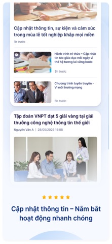
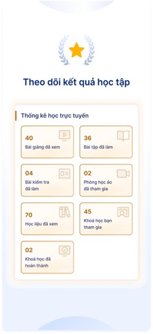
Captions read from the screenshots (OCR, may contain small errors): 4 headlines, 17 words on average (longest 21).
Screenshots





iPad screenshots


Icon palette
About this app
Đào tạo nhân sự đơn giản và hiệu quả hơn với vnEdu LMS phiên bản Doanh nghiệp vnEdu LMS phiên bản Doanh nghiệp là giải pháp số hóa toàn diện cho hoạt động đào tạo nội bộ, giúp doanh nghiệp chuẩn hóa quy trình bồi dưỡng nhân sự, nâng cao chất lượng nguồn lực và tối ưu chi phí đào tạo. Hệ thống đóng vai trò là nền tảng kết nối giữa nhân viên – doanh nghiệp, từ đó nâng cao hiệu quả quản trị và phát triển năng lực trong doanh nghiệp. Với giao diện hiện đại, thân thiện và đầy đủ các chức năng quản lý đào tạo chuyên nghiệp, vnEdu LMS phiên bản Doanh nghiệp mang đến nhiều tiện ích nổi bật như: • Tổ chức đào tạo linh hoạt: Nhân viên có thể tham gia khóa học trực tuyến, học tập theo lộ trình công việc, nhận thông báo, trao đổi với giảng viên hoặc chuyên gia nội bộ ngay trên hệ thống. • Đánh giá – kiểm tra – thi trực tuyến: Làm bài tập, bài kiểm tra, thi đánh giá ngay trên hệ thống để đảm bả…
App details
What you can learn from VNPT Elearning Enterprise V2
Every shipping app on the App Store has gone through the same decisions you're working through right now: which screenshot goes first, what caption sits over it, which device frame to show, what color the background should be. The 16 screenshots above are VNPT Elearning Enterprise V2's answers to those questions — they're public, they're real, and they made it through Apple's review.
What the numbers say: VNPT Elearning Enterprise V2 runs a light set with one background colour (#FCFCFC) carried across every screenshot — the listing reads as a single poster when the shots sit side by side in search results. The accent colour we picked up, #2474DC, is the one to reuse for badges, arrows and highlighted words if you borrow this look. Hit Use this style to open the editor with these exact colours and drop your own screenshot in.
Notice the first screenshot in particular. It's the one users see in search results and on the product page, and it's where most apps spend their best caption and tightest design. Look at the proportion of background to phone, where the text sits, what one thing the image is trying to communicate.
Want to see how other Education apps approach the same problem? Browse more Education apps in the showcase.
Take what works into your own screenshots
Open LaunchShots and design your App Store & Google Play screenshots — pick a device frame, drop captions, ship in minutes. Free, in your browser.
Open the screenshot editor →Apps with a similar look
Closest background + accent colours among the listings we've analysed — useful when you want to see the same palette handled by a different team.