Screenshot style breakdown
Sampled from 4 of NetRoom: Cho Thuê Nhà Trọ's App Store screenshots — background, accent and theme, measured by LaunchShots (not something Apple publishes).
#FCFCFC bg
#DDDDDD
#2474DC accent
#111111 text
Screenshots



iPad screenshots


Icon palette
About this app
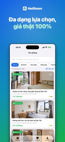
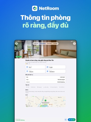
NetRoom – ứng dụng tìm và thuê phòng trọ nhanh chóng, minh bạch, dành cho thị trường Việt Nam. TÌM PHÒNG DỄ DÀNG • Danh sách phòng trọ đa dạng kèm hình ảnh chi tiết • Bộ lọc thông minh theo khu vực, mức giá và tiện ích • Tìm phòng trên bản đồ — định vị quanh khu vực bạn muốn an cư • Thông tin đầy đủ: địa chỉ, diện tích, sức chứa, vệ sinh khép kín, tiền đặt cọc, biểu phí dịch vụ THÔNG TIN RÕ RÀNG • Giá thuê hiển thị rõ ràng theo tháng • Mỗi phòng có đầy đủ tiện ích, phí dịch vụ và vị trí trên bản đồ KẾT NỐI TRỰC TIẾP • Xem số điện thoại chủ nhà ngay trong ứng dụng • Gửi yêu cầu hẹn xem phòng theo thời gian phù hợp • Lưu phòng yêu thích để xem lại sau ĐĂNG NHẬP TIỆN LỢI • Đăng nhập nhanh và an toàn bằng tài khoản Apple NetRoom by NET Partners — nền tảng tìm kiếm phòng trọ hiện đại, giúp bạn tìm phòng trọ ưng ý chỉ trong 1 nốt nhạc.
App details
What you can learn from NetRoom: Cho Thuê Nhà Trọ
Every shipping app on the App Store has gone through the same decisions you're working through right now: which screenshot goes first, what caption sits over it, which device frame to show, what color the background should be. The 8 screenshots above are NetRoom: Cho Thuê Nhà Trọ's answers to those questions — they're public, they're real, and they made it through Apple's review.
What the numbers say: NetRoom: Cho Thuê Nhà Trọ runs a mixed light-and-dark set where the background shifts from screenshot to screenshot (first shot #FCFCFC) — each image has to stand on its own, so the captions carry more of the story. The accent colour we picked up, #2474DC, is the one to reuse for badges, arrows and highlighted words if you borrow this look. Hit Use this style to open the editor with these exact colours and drop your own screenshot in.
Notice the first screenshot in particular. It's the one users see in search results and on the product page, and it's where most apps spend their best caption and tightest design. Look at the proportion of background to phone, where the text sits, what one thing the image is trying to communicate.
Want to see how other Lifestyle apps approach the same problem? Browse more Lifestyle apps in the showcase.
Take what works into your own screenshots
Open LaunchShots and design your App Store & Google Play screenshots — pick a device frame, drop captions, ship in minutes. Free, in your browser.
Open the screenshot editor →Apps with a similar look
Closest background + accent colours among the listings we've analysed — useful when you want to see the same palette handled by a different team.