Screenshot style breakdown
Sampled from 6 of Memory Box's App Store screenshots — background, accent and theme, measured by LaunchShots (not something Apple publishes).
#F4ECFC bg
#D6CFDD
#2C047C accent
#111111 text
Screenshots


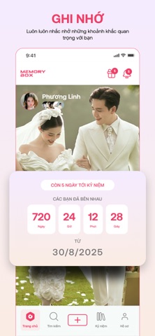


iPad screenshots


Icon palette
About this app
MemoryBox - Ứng dụng đồng hành chính thức từ hệ sinh thái SnapBox Được phát triển trực tiếp bởi SnapBox - thương hiệu sản xuất máy photobooth thế hệ mới, MemoryBox là ứng dụng sinh ra để "số hóa" hoàn toàn trải nghiệm chụp ảnh của bạn. Không chỉ dừng lại ở việc quét QR lấy ảnh gốc cực nét, MemoryBox được thiết kế chuyên biệt để giải quyết 2 nhu cầu lớn nhất của giới trẻ sau khi chụp hình: Khoe ảnh và Lưu giữ cột mốc thời gian. TÍNH NĂNG NỔI BẬT: 1. Mạng xã hội chia sẻ ảnh Photobooth Lấy file gốc, video chất lượng cao từ máy SnapBox về điện thoại chỉ trong 1 giây quét mã. Sau đó? Hãy đăng tải ngay lên trang chủ MemoryBox! Trải nghiệm giao diện lướt chạm tràn viền cực mượt, nơi bạn có thể "flex" những concept chụp ảnh độc lạ, pose dáng đỉnh cao của mình. Thả tim, bình luận, follow bạn bè và "bắt trend" cùng hàng ngàn tín đồ đam mê photobooth trên toàn quốc. 2. Đếm ngày kỷ niệm thông …
App details
What you can learn from Memory Box
Every shipping app on the App Store has gone through the same decisions you're working through right now: which screenshot goes first, what caption sits over it, which device frame to show, what color the background should be. The 12 screenshots above are Memory Box's answers to those questions — they're public, they're real, and they made it through Apple's review.
What the numbers say: Memory Box runs a light set with one background colour (#F4ECFC) carried across every screenshot — the listing reads as a single poster when the shots sit side by side in search results. The accent colour we picked up, #2C047C, is the one to reuse for badges, arrows and highlighted words if you borrow this look. Hit Use this style to open the editor with these exact colours and drop your own screenshot in.
Notice the first screenshot in particular. It's the one users see in search results and on the product page, and it's where most apps spend their best caption and tightest design. Look at the proportion of background to phone, where the text sits, what one thing the image is trying to communicate.
Want to see how other Lifestyle apps approach the same problem? Browse more Lifestyle apps in the showcase.
Take what works into your own screenshots
Open LaunchShots and design your App Store & Google Play screenshots — pick a device frame, drop captions, ship in minutes. Free, in your browser.
Open the screenshot editor →Apps with a similar look
Closest background + accent colours among the listings we've analysed — useful when you want to see the same palette handled by a different team.