Chart position — tracked daily by LaunchShots
Screenshot style breakdown
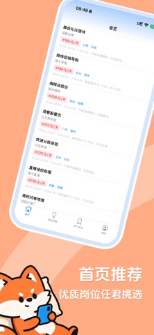
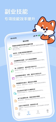
Sampled from 4 of 日结侠's App Store screenshots — background, accent and theme, measured by LaunchShots (not something Apple publishes).
#ACCCFC bg
#97B3DD
#F47C44 accent
#111111 text
- #3副业 技能 专项 技能 效率 提升 f
- #4学 习 天 注 收藏 核心 学 习 资料
Captions read from the screenshots (OCR, may contain small errors): 2 headlines, 8 words on average (longest 9).
Screenshots


Icon palette
About this app
日结侠是一款专注副业技能学习与灵活工作提升的应用,帮助用户了解日结工作、短期工作及其他灵活就业机会,同时通过实用工具和求职指南提升工作准备与收入管理能力。 日结侠围绕“快做快结”服务理念,提供日结岗位信息、工时与薪资计算、兼职日历、排班安排等实用内容,帮助用户了解岗位要求、工作时间、薪资口径和结算规则。对标注“当天结算”的岗位,实际结算时间以岗位详情页及招聘方说明为准。 你可以在日结侠中: - 了解日结工作、短期工作和灵活就业机会 - 学习求职、防骗、工时管理与收入核算知识 - 使用工时对账、薪资计算、兼职日历等实用工具 - 按城市、距离、岗位类型和工作时间筛选岗位 - 查看岗位职责、上工安排、薪资展示和结算方式 - 收藏岗位后报名或与招聘方进一步沟通 日结侠官方网站: https://www.qlrjx.com/
App details
What you can learn from 日结侠
Every shipping app on the App Store has gone through the same decisions you're working through right now: which screenshot goes first, what caption sits over it, which device frame to show, what color the background should be. The 4 screenshots above are 日结侠's answers to those questions — they're public, they're real, and they made it through Apple's review.
What the numbers say: 日结侠 runs a light set where the background shifts from screenshot to screenshot (first shot #ACCCFC) — each image has to stand on its own, so the captions carry more of the story. The accent colour we picked up, #F47C44, is the one to reuse for badges, arrows and highlighted words if you borrow this look. Hit Use this style to open the editor with these exact colours and drop your own screenshot in.
Notice the first screenshot in particular. It's the one users see in search results and on the product page, and it's where most apps spend their best caption and tightest design. Look at the proportion of background to phone, where the text sits, what one thing the image is trying to communicate.
Want to see how other Reference apps approach the same problem? Browse more Reference apps in the showcase.
Take what works into your own screenshots
Open LaunchShots and design your App Store & Google Play screenshots — pick a device frame, drop captions, ship in minutes. Free, in your browser.
Open the screenshot editor →Apps with a similar look
Closest background + accent colours among the listings we've analysed — useful when you want to see the same palette handled by a different team.