Screenshot style breakdown
Sampled from 4 of Dragon Raja: Thức Tỉnh's App Store screenshots — background, accent and theme, measured by LaunchShots (not something Apple publishes).
#141414 bg
#343434
#34447C accent
#FFFFFF text
Screenshots
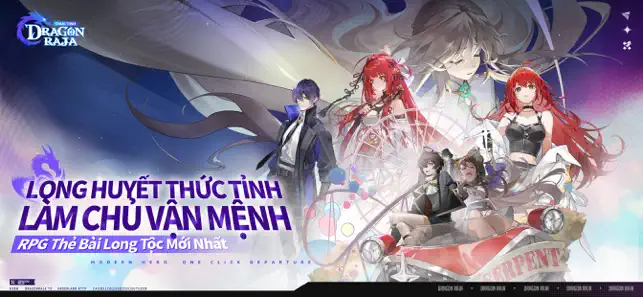

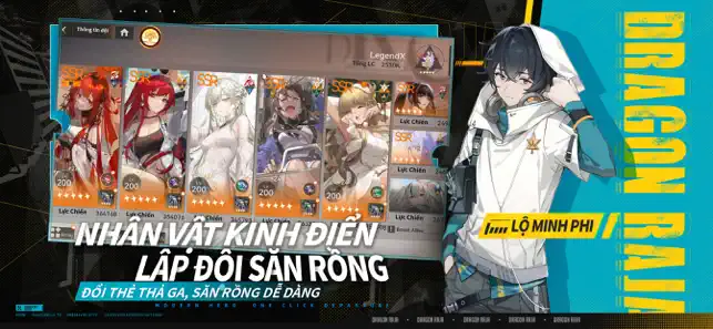
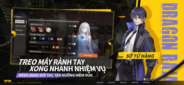
Icon palette
About this app
"Là siêu phẩm thẻ bài RPG mới nhất thuộc series Dragon Raja, [Dragon Raja: Thức Tỉnh] mang đến trải nghiệm phiêu lưu vừa giải trí nhẹ nhàng vừa nhiệt huyết sục sôi! Hóa thân thành chiến binh hiện đại, bước vào thế giới săn rồng, khởi đầu hành trình bùng cháy từng khoảnh khắc - Chạm, vượt ải, diệt rồng, tất cả chỉ trong một nốt nhạc! Nhà thám hiểm thân mến, cánh cổng Học viện Cassell đã rộng mở chào đón thế hệ săn rồng mới. Trước khi xuất phát, hãy xem qua Cẩm Nang Dũng Sĩ này, chuẩn bị hành trang để lao vào hành trình đan xen giữa nhiệt huyết và cảm động này nhé! [Đăng Nhập Tặng 400 Lượt Quay, Erii SSR Miễn Phí] Đăng nhập nhận ngay 400 Vé Chiêu Mộ, điểm danh mở khóa miễn phí SSR Uesugi Erii! Tỷ lệ nổ cực cao, Quay X10 ra 3 phẩm Vàng, cùng với vô số tài nguyên tiếp tế miễn phí, quất gacha không phải rầu, dễ dàng xây dựng đội hình cực mạnh. [Nhân Vật Kinh Điển, Lập Đội Săn Rồng] Các nhâ…
App details
What you can learn from Dragon Raja: Thức Tỉnh
Every shipping app on the App Store has gone through the same decisions you're working through right now: which screenshot goes first, what caption sits over it, which device frame to show, what color the background should be. The 4 screenshots above are Dragon Raja: Thức Tỉnh's answers to those questions — they're public, they're real, and they made it through Apple's review.
What the numbers say: Dragon Raja: Thức Tỉnh runs a dark set with one background colour (#141414) carried across every screenshot — the listing reads as a single poster when the shots sit side by side in search results. The accent colour we picked up, #34447C, is the one to reuse for badges, arrows and highlighted words if you borrow this look. Hit Use this style to open the editor with these exact colours and drop your own screenshot in.
Notice the first screenshot in particular. It's the one users see in search results and on the product page, and it's where most apps spend their best caption and tightest design. Look at the proportion of background to phone, where the text sits, what one thing the image is trying to communicate.
Want to see how other Games apps approach the same problem? Browse more Games apps in the showcase.
Take what works into your own screenshots
Open LaunchShots and design your App Store & Google Play screenshots — pick a device frame, drop captions, ship in minutes. Free, in your browser.
Open the screenshot editor →Apps with a similar look
Closest background + accent colours among the listings we've analysed — useful when you want to see the same palette handled by a different team.