Chart position — tracked daily by LaunchShots
Screenshot changes — detected by LaunchShots
Screenshot style breakdown
Sampled from 4 of Seçim 2026 Oyunu : Online's App Store screenshots — background, accent and theme, measured by LaunchShots (not something Apple publishes).
#3494FC bg
#50A2FC
#FCBC9C accent
#FFFFFF text
Reading the caption text from the screenshots in your browser…
Screenshots


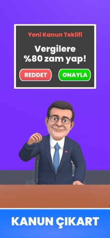

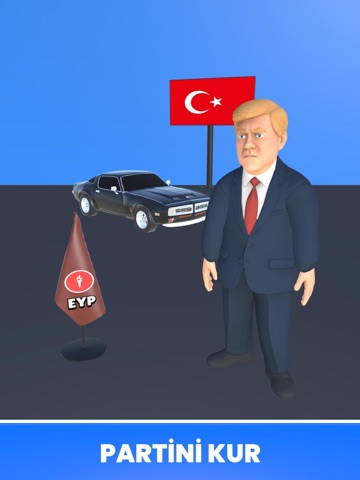
iPad screenshots


Icon palette
About this app
Ülkeni yönetmeye hazır mısın? Seçim 2026 Oyunu: Online, Türkiye temalı en kapsamlı online başkanlık ve seçim simülasyonu ile seni gerçek bir liderlik mücadelesine davet ediyor. Kendi liderini yarat, partini kur, halkın desteğini kazan ve gerçek oyunculara karşı iktidar savaşına gir! OYUNDA SENİ NELER BEKLİYOR? VIP 3D Başkan Karakterleri Özel animasyonlu, sahneli premium liderlerle rakiplerinden ayrış. Gelişmiş 3D Miting Alanları Türkiye’nin farklı şehirlerinde miting yap, kalabalığı etkile, oy oranını yükselt. Online İttifak Sistemi Gerçek oyuncularla ittifak kur, sohbet et, yardımlaş ve birlikte güçlen. Canlı Chat & Sosyal Etkileşim Global ve ittifak sohbetleriyle rakiplerini tanı, stratejini geliştir. Gerçek Zamanlı Leaderboard Bireysel ve ittifak sıralamalarında zirveye çık. Kanun & Yönetim Sistemi Kanunlar çıkar, kararlar al ve ülkenin kaderini değiştir. Detaylı Özel…
App details
What you can learn from Seçim 2026 Oyunu : Online
Every shipping app on the App Store has gone through the same decisions you're working through right now: which screenshot goes first, what caption sits over it, which device frame to show, what color the background should be. The 7 screenshots above are Seçim 2026 Oyunu : Online's answers to those questions — they're public, they're real, and they made it through Apple's review.
What the numbers say: Seçim 2026 Oyunu : Online runs a mixed light-and-dark set where the background shifts from screenshot to screenshot (first shot #3494FC) — each image has to stand on its own, so the captions carry more of the story. The accent colour we picked up, #FCBC9C, is the one to reuse for badges, arrows and highlighted words if you borrow this look. Hit Use this style to open the editor with these exact colours and drop your own screenshot in.
Notice the first screenshot in particular. It's the one users see in search results and on the product page, and it's where most apps spend their best caption and tightest design. Look at the proportion of background to phone, where the text sits, what one thing the image is trying to communicate.
Want to see how other Games apps approach the same problem? Browse more Games apps in the showcase.
Take what works into your own screenshots
Open LaunchShots and design your App Store & Google Play screenshots — pick a device frame, drop captions, ship in minutes. Free, in your browser.
Open the screenshot editor →Apps with a similar look
Closest background + accent colours among the listings we've analysed — useful when you want to see the same palette handled by a different team.