Chart position — tracked daily by LaunchShots
Screenshot style breakdown
Sampled from 6 of Findy: Online Alışveriş's App Store screenshots — background, accent and theme, measured by LaunchShots (not something Apple publishes).
#8CBCE4 bg
#7BA5C8
#3C8CEC accent
#111111 text
Screenshots


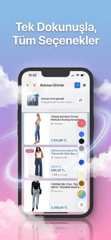


iPad screenshots


Icon palette
About this app
Findy: Fotoğrafla Aradığın Ürünü Saniyeler İçinde Bul Aradığın ürünü fotoğrafını çekerek onlarca mağazada anında keşfet! Findy'nin akıllı görsel arama teknolojisiyle en doğru sonuçlara saniyeler içinde ulaş. Fiyata göre filtrele, sana en uygun seçeneği bul. İster fotoğraf çek ister ürün adını yaz; onlarca mağazadan gelen sonuçları tek ekranda gör. Findy Kombin ile Tarzını Keşfet. Beğendiğin bir kombindeki her bir parçayı ayrı ayrı tanı ve benzerlerini farklı mağazalarda keşfet. Üst, alt, ayakkabı, çanta — hangi parçayı istersen fotoğrafını çek, benzerlerini anında bul. Findy Market ile Akıllı Alışveriş Zamanı. Marketteki raf etiketini okut, aynı ürünü farklı marketlerde ara ve fiyatları gör. En uygun fiyatı bul, bütçeni kontrol altında tut. Yakınımdaki Mağazalar ile aradığın ürünü satan en yakın mağazaları harita üzerinde bul. Hangi mağaza ne kadar uzakta, açık mı kapalı mı — hepsin…
App details
What you can learn from Findy: Online Alışveriş
Every shipping app on the App Store has gone through the same decisions you're working through right now: which screenshot goes first, what caption sits over it, which device frame to show, what color the background should be. The 14 screenshots above are Findy: Online Alışveriş's answers to those questions — they're public, they're real, and they made it through Apple's review.
What the numbers say: Findy: Online Alışveriş runs a mixed light-and-dark set where the background shifts from screenshot to screenshot (first shot #8CBCE4) — each image has to stand on its own, so the captions carry more of the story. The accent colour we picked up, #3C8CEC, is the one to reuse for badges, arrows and highlighted words if you borrow this look. Hit Use this style to open the editor with these exact colours and drop your own screenshot in.
Notice the first screenshot in particular. It's the one users see in search results and on the product page, and it's where most apps spend their best caption and tightest design. Look at the proportion of background to phone, where the text sits, what one thing the image is trying to communicate.
Want to see how other Shopping apps approach the same problem? Browse more Shopping apps in the showcase.
Take what works into your own screenshots
Open LaunchShots and design your App Store & Google Play screenshots — pick a device frame, drop captions, ship in minutes. Free, in your browser.
Open the screenshot editor →Apps with a similar look
Closest background + accent colours among the listings we've analysed — useful when you want to see the same palette handled by a different team.