Screenshot style breakdown
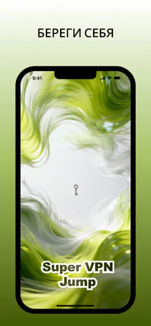
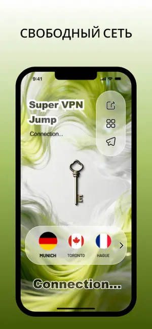
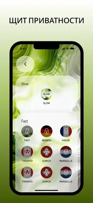
Sampled from 4 of ВПН - Супер VPN Jump's App Store screenshots — background, accent and theme, measured by LaunchShots (not something Apple publishes).
#FCFCFC bg
#DDDDDD
#445C04 accent
#111111 text
Screenshots
Icon palette
About this app
ВАШИ ДАННЫЕ ЗАСЛУЖИВАЮТ ПРИВАТНОСТИ БЕЗ ГРАНИЦ. В эпоху цифрового слежения каждый ваш шаг в сети анализируется. ВПН - Супер VPN Jump создан для того, чтобы стереть эти следы. Это больше, чем просто приложение ВПН — это ваш персональный инструмент для мгновенного перехода в зону безопасности. Мы верим, что ваша активность в интернете — это только ваше дело. Используя наше продвинутое ВПН-шифрование, вы буквально выпрыгиваете из системы слежки в защищенный канал, созданный исключительно для ваших данных. Почему стоит выбрать Супер VPN Jump? Мгновенная активация: Никаких сложных меню. Один тап — и ваше ВПН-соединение активно. Высокоскоростные узлы: Наши ВПН-серверы — это мощные двигатели, созданные для работы на высоких скоростях, обеспечивая при этом надежный ВПН-щит. Безопасный прыжок: Мы используем современные протоколы, чтобы ваш ВПН-туннель был непроницаемым с первой микросекунд…
App details
What you can learn from ВПН - Супер VPN Jump
Every shipping app on the App Store has gone through the same decisions you're working through right now: which screenshot goes first, what caption sits over it, which device frame to show, what color the background should be. The 4 screenshots above are ВПН - Супер VPN Jump's answers to those questions — they're public, they're real, and they made it through Apple's review.
What the numbers say: ВПН - Супер VPN Jump runs a light set with one background colour (#FCFCFC) carried across every screenshot — the listing reads as a single poster when the shots sit side by side in search results. The accent colour we picked up, #445C04, is the one to reuse for badges, arrows and highlighted words if you borrow this look. Hit Use this style to open the editor with these exact colours and drop your own screenshot in.
Notice the first screenshot in particular. It's the one users see in search results and on the product page, and it's where most apps spend their best caption and tightest design. Look at the proportion of background to phone, where the text sits, what one thing the image is trying to communicate.
Want to see how other Utilities apps approach the same problem? Browse more Utilities apps in the showcase.
Take what works into your own screenshots
Open LaunchShots and design your App Store & Google Play screenshots — pick a device frame, drop captions, ship in minutes. Free, in your browser.
Open the screenshot editor →Apps with a similar look
Closest background + accent colours among the listings we've analysed — useful when you want to see the same palette handled by a different team.