Chart position — tracked daily by LaunchShots
Screenshot changes — detected by LaunchShots
Screenshot style breakdown
Sampled from 6 of Layers: Что надеть's App Store screenshots — background, accent and theme, measured by LaunchShots (not something Apple publishes).
#DCE4F4 bg
#C1C8D6
#5494BC accent
#111111 text
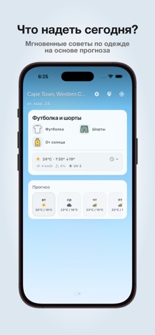
- #1Что надеть сегодня? Мгновенные советы по одежде на основе прогноза
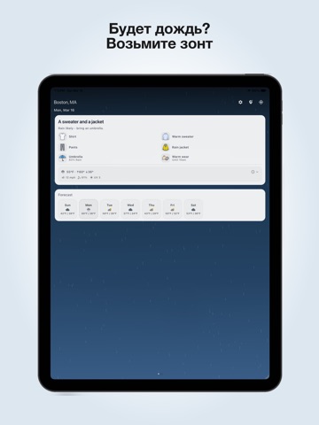
- #2Будет дождь? Возьмите зонт Хило, HI © 6 ©
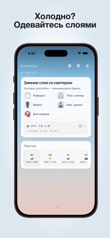
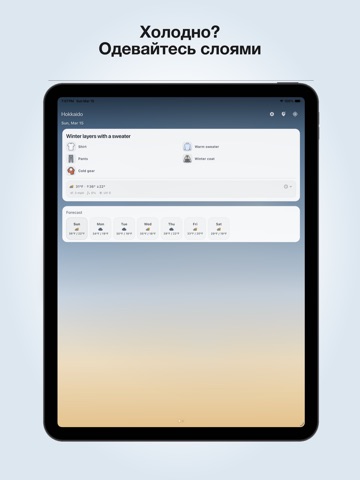
- #3Холодно? Одевайтесь слоями
- #4Жарко? Оставайтесь в прохладе и защищайтесь от солнца
- #5Что понадобится на эту неделю
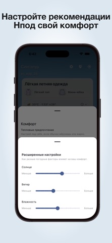
- #6Настройте рекомендации Нпод свой комфорт
Captions read from the screenshots (OCR, may contain small errors): 6 headlines, 6.7 words on average (longest 10).
Screenshots



iPad screenshots

Icon palette
About this app
Layers помогает решить, что надеть, исходя из погоды там, где вы находитесь. Вместо сухих прогнозов и цифр Layers превращает реальные погодные данные в понятные персональные рекомендации. Жарко, холодно, дождливо, ветрено или погода меняется — вы будете точно знать, как одеться перед выходом. Почему Layers • Узнайте, что надеть сегодня, а не только температуру • Рекомендации учитывают дождь, ветер, солнце, влажность и перепады температуры • Персональные настройки комфорта (вы мерзнете или вам обычно жарко) • Режим доверия — чистый, без отвлекающих деталей • Чистый, сфокусированный дизайн — без рекламы Функции • Рекомендации по одежде на основе погоды • Прогноз на несколько дней и планирование сборов • Калибровка комфорта: температура и чувствительность к погоде • Виджеты на экран «Домой» • Поиск локаций и сохранённые места • Метрические и имперские единицы Layers создан, чтобы упрос…
App details
What you can learn from Layers: Что надеть
Every shipping app on the App Store has gone through the same decisions you're working through right now: which screenshot goes first, what caption sits over it, which device frame to show, what color the background should be. The 9 screenshots above are Layers: Что надеть's answers to those questions — they're public, they're real, and they made it through Apple's review.
What the numbers say: Layers: Что надеть runs a light set with one background colour (#DCE4F4) carried across every screenshot — the listing reads as a single poster when the shots sit side by side in search results. The accent colour we picked up, #5494BC, is the one to reuse for badges, arrows and highlighted words if you borrow this look. Hit Use this style to open the editor with these exact colours and drop your own screenshot in.
Notice the first screenshot in particular. It's the one users see in search results and on the product page, and it's where most apps spend their best caption and tightest design. Look at the proportion of background to phone, where the text sits, what one thing the image is trying to communicate.
Want to see how other Weather apps approach the same problem? Browse more Weather apps in the showcase.
Take what works into your own screenshots
Open LaunchShots and design your App Store & Google Play screenshots — pick a device frame, drop captions, ship in minutes. Free, in your browser.
Open the screenshot editor →Apps with a similar look
Closest background + accent colours among the listings we've analysed — useful when you want to see the same palette handled by a different team.