Chart position — tracked daily by LaunchShots
Screenshot changes — detected by LaunchShots
Screenshot style breakdown
Sampled from 6 of Minber - Ezan Vakitleri's App Store screenshots — background, accent and theme, measured by LaunchShots (not something Apple publishes).
#14643C bg
#347957
#5C9474 accent
#FFFFFF text
Screenshots
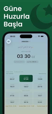

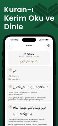
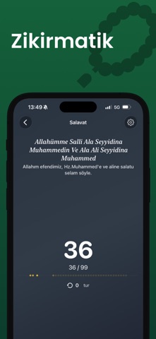
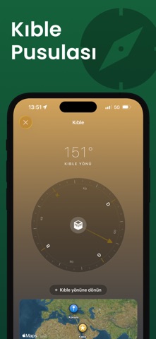

iPad screenshots


Icon palette
About this app
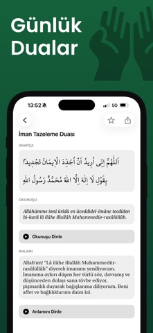
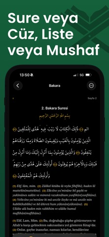
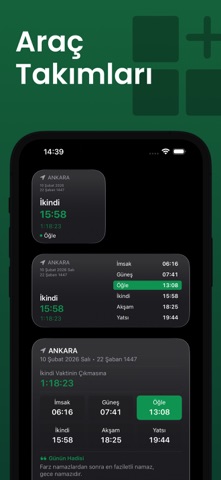
Namaz vakitlerinizi takip etmenin en şık ve kolay yolu. Minber; namaz, Kuran-ı Kerim, dua, zikir ve kıble bir arada — günlük ibadetlerinize eşlik eden kapsamlı bir İslami yaşam uygulaması. Kuran-ı Kerim Kuran'ı sure veya cüz olarak okuyun. Liste görünümünde ayet ayet meal ve okunuşla, Mushaf (Sayfa) görünümünde gerçek mushaf hissiyle. Tecvid renkleri, birden fazla kâri ile sesli dinleme, Diyanet meali ve daha fazlası. Mushaf'ta Arapça ayete dokun — kaldığın yerden devam et. Kâri ses paketlerini istediğiniz zaman indirin veya silin. Günlük Dualar Abdest, namaz, yemek, uyku, yolculuk ve daha fazlası için kategorilere ayrılmış zengin dua kütüphanesi. Arapça, okunuş ve anlamı bir arada; sesli dinleme desteği ile. Namaz Vakitleri Bulunduğunuz konuma göre İmsak, Güneş, Öğle, İkindi, Akşam ve Yatsı vakitlerini anlık olarak görüntüleyin. Bir sonraki vakte ne kadar kaldığını canlı geri sayım …
App details
What you can learn from Minber - Ezan Vakitleri
Every shipping app on the App Store has gone through the same decisions you're working through right now: which screenshot goes first, what caption sits over it, which device frame to show, what color the background should be. The 17 screenshots above are Minber - Ezan Vakitleri's answers to those questions — they're public, they're real, and they made it through Apple's review.
What the numbers say: Minber - Ezan Vakitleri runs a dark set with one background colour (#14643C) carried across every screenshot — the listing reads as a single poster when the shots sit side by side in search results. The accent colour we picked up, #5C9474, is the one to reuse for badges, arrows and highlighted words if you borrow this look. Hit Use this style to open the editor with these exact colours and drop your own screenshot in.
Notice the first screenshot in particular. It's the one users see in search results and on the product page, and it's where most apps spend their best caption and tightest design. Look at the proportion of background to phone, where the text sits, what one thing the image is trying to communicate.
Want to see how other Reference apps approach the same problem? Browse more Reference apps in the showcase.
Take what works into your own screenshots
Open LaunchShots and design your App Store & Google Play screenshots — pick a device frame, drop captions, ship in minutes. Free, in your browser.
Open the screenshot editor →Apps with a similar look
Closest background + accent colours among the listings we've analysed — useful when you want to see the same palette handled by a different team.