Chart position — tracked daily by LaunchShots
Screenshot style breakdown
Sampled from 5 of Share Location Tracker: RideUp's App Store screenshots — background, accent and theme, measured by LaunchShots (not something Apple publishes).
#FCFCFC bg
#DDDDDD
#6CBC2C accent
#111111 text
Screenshots


Icon palette
About this app
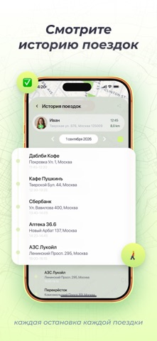
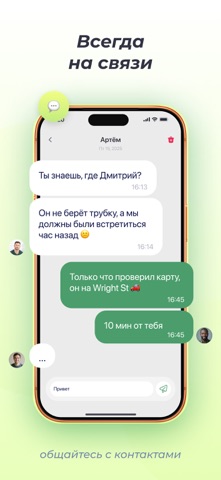
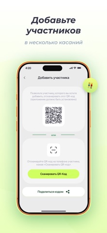
Жизнь полна забот: дети идут в школу, пожилые родители выходят на прогулку, друзья теряются в незнакомом городе. Приложение RideUp создано, чтобы вы оставались на связи и знали, где находятся самые важные для вас люди, уважая при этом их конфиденциальность. Это не просто GPS-отслеживание. Это умный инструмент для спокойствия и безопасности. Вместо бесконечных звонков «Ты где?» – получайте точные данные в реальном времени. Ключевые функции: Круглосуточный обмен местоположением: Приглашайте участников в частные группы (семья, коллеги, туристическая группа). Все видят местоположение друг друга на интерактивной карте. Вы решаете, когда и с кем делиться своими данными. Безопасные зоны: Установите зоны «дом» или «школа». Как только ребенок входит в них или покидает – приложение мгновенно отправляет push-уведомление на ваш смартфон. Идеально для контроля прихода домой или перемены в школе.…
App details
What you can learn from Share Location Tracker: RideUp
Every shipping app on the App Store has gone through the same decisions you're working through right now: which screenshot goes first, what caption sits over it, which device frame to show, what color the background should be. The 5 screenshots above are Share Location Tracker: RideUp's answers to those questions — they're public, they're real, and they made it through Apple's review.
What the numbers say: Share Location Tracker: RideUp runs a light set with one background colour (#FCFCFC) carried across every screenshot — the listing reads as a single poster when the shots sit side by side in search results. The accent colour we picked up, #6CBC2C, is the one to reuse for badges, arrows and highlighted words if you borrow this look. Hit Use this style to open the editor with these exact colours and drop your own screenshot in.
Notice the first screenshot in particular. It's the one users see in search results and on the product page, and it's where most apps spend their best caption and tightest design. Look at the proportion of background to phone, where the text sits, what one thing the image is trying to communicate.
Want to see how other Navigation apps approach the same problem? Browse more Navigation apps in the showcase.
Take what works into your own screenshots
Open LaunchShots and design your App Store & Google Play screenshots — pick a device frame, drop captions, ship in minutes. Free, in your browser.
Open the screenshot editor →Apps with a similar look
Closest background + accent colours among the listings we've analysed — useful when you want to see the same palette handled by a different team.