Chart position — tracked daily by LaunchShots
Screenshot changes — detected by LaunchShots
Screenshot style breakdown
Sampled from 6 of RecoRe - 野球観戦記録アプリ's App Store screenshots — background, accent and theme, measured by LaunchShots (not something Apple publishes).
#0C0C0C bg
#2E2E2E
#2C44AC accent
#FFFFFF text
Screenshots






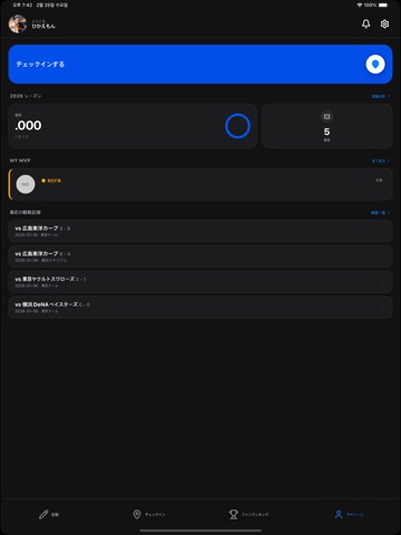
iPad screenshots

Icon palette
About this app
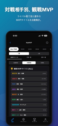
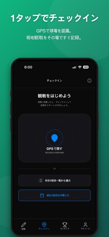
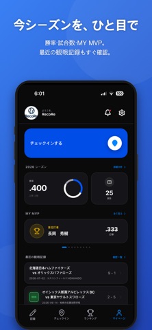
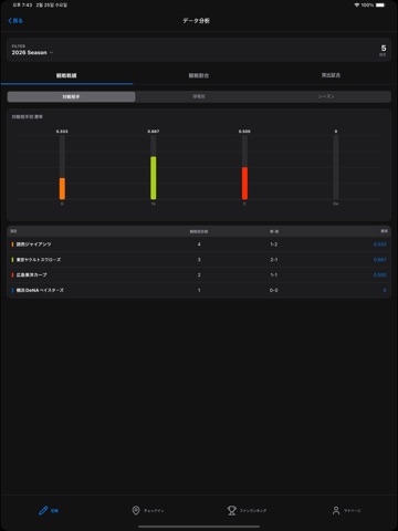
【あなたの観戦ライフを、もっと楽しく、もっと深く。】 RecoRe(レコレ)は、プロ野球ファンのための「観戦記録・分析・コレクション」アプリです。 「あの試合、誰が投げたっけ?」「現地観戦の勝率はどのくらい?」 そんなファンの疑問や思い出を、データとともに美しく可視化します。 ■ RecoRe の主な機能 ・データ連携で簡単記録 データスタジアム社の成績データと連携。GPSチェックインするだけで、その日の試合詳細(スコア、出場選手、試合時間など)が自動であなたの記録に紐付きます。面倒な手入力は不要です。 ・「My観戦勝率」を知る あなたの現地観戦成績を自動集計。「球団別」「球場別」「曜日別」の勝率や、得点・失点傾向をグラフで分析できます。 独自の「My MVPランキング」を作成して、選手の活躍を振り返りましょう。 ・球場巡りをコレクション 日本全国のプロ野球開催球場をマップ上にプロット。訪れた球場が増えるたびにマップが埋まっていく快感を味わえます。 ・バッジ機能 「通算100観戦」「全12球団本拠地制覇」など、観戦スタ…
App details
What you can learn from RecoRe - 野球観戦記録アプリ
Every shipping app on the App Store has gone through the same decisions you're working through right now: which screenshot goes first, what caption sits over it, which device frame to show, what color the background should be. The 12 screenshots above are RecoRe - 野球観戦記録アプリ's answers to those questions — they're public, they're real, and they made it through Apple's review.
What the numbers say: RecoRe - 野球観戦記録アプリ runs a dark set with one background colour (#0C0C0C) carried across every screenshot — the listing reads as a single poster when the shots sit side by side in search results. The accent colour we picked up, #2C44AC, is the one to reuse for badges, arrows and highlighted words if you borrow this look. Hit Use this style to open the editor with these exact colours and drop your own screenshot in.
Notice the first screenshot in particular. It's the one users see in search results and on the product page, and it's where most apps spend their best caption and tightest design. Look at the proportion of background to phone, where the text sits, what one thing the image is trying to communicate.
Want to see how other Sports apps approach the same problem? Browse more Sports apps in the showcase.
Take what works into your own screenshots
Open LaunchShots and design your App Store & Google Play screenshots — pick a device frame, drop captions, ship in minutes. Free, in your browser.
Open the screenshot editor →Apps with a similar look
Closest background + accent colours among the listings we've analysed — useful when you want to see the same palette handled by a different team.