Screenshot style breakdown
Sampled from 6 of DeTapas - Tapas y Bares's App Store screenshots — background, accent and theme, measured by LaunchShots (not something Apple publishes).
#F4F4F4 bg
#D6D6D6
#EC940C accent
#111111 text
Screenshots


iPad screenshots





Icon palette
About this app
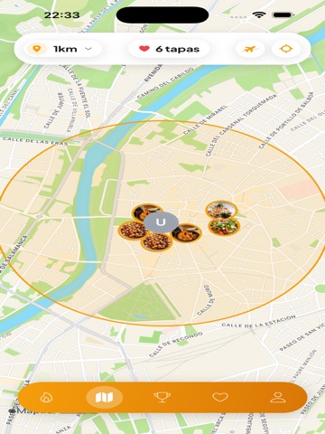
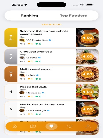
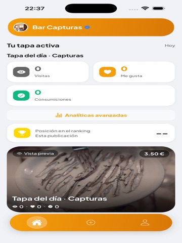
DeTapas es la app para amantes del tapeo. Descubre tapas cerca de ti, guarda las que te gustan, valídalas al visitar el bar y compite en el ranking de tu zona. PARA USUARIOS • Descubre tapas del día con swipe cerca de ti • Explóralas en el mapa y navega hasta el local • Guarda tus tapas favoritas y valida tu visita • Gana XP, desbloquea badges y sube en el ranking • Filtra por dieta, alérgenos, precio y momento del día PARA PROPIETARIOS • Publica la tapa del día con foto, precio y disponibilidad • Llega a gente que busca tapeo cerca ahora mismo • Gestiona tu local desde un panel sencillo • Planes Premium con más tapas al día, destacados y analíticas PREMIUM USUARIO • Sin anuncios • Likes diarios ilimitados • Radio de búsqueda ampliado y Modo Viajero • Filtros avanzados Disponible en español. Se necesita ubicación para mostrar tapas cercanas. Terms of Use (EULA): https://www.apple.c…
App details
What you can learn from DeTapas - Tapas y Bares
Every shipping app on the App Store has gone through the same decisions you're working through right now: which screenshot goes first, what caption sits over it, which device frame to show, what color the background should be. The 16 screenshots above are DeTapas - Tapas y Bares's answers to those questions — they're public, they're real, and they made it through Apple's review.
What the numbers say: DeTapas - Tapas y Bares runs a light set with one background colour (#F4F4F4) carried across every screenshot — the listing reads as a single poster when the shots sit side by side in search results. The accent colour we picked up, #EC940C, is the one to reuse for badges, arrows and highlighted words if you borrow this look. Hit Use this style to open the editor with these exact colours and drop your own screenshot in.
Notice the first screenshot in particular. It's the one users see in search results and on the product page, and it's where most apps spend their best caption and tightest design. Look at the proportion of background to phone, where the text sits, what one thing the image is trying to communicate.
Want to see how other Food & Drink apps approach the same problem? Browse more Food & Drink apps in the showcase.
Take what works into your own screenshots
Open LaunchShots and design your App Store & Google Play screenshots — pick a device frame, drop captions, ship in minutes. Free, in your browser.
Open the screenshot editor →Apps with a similar look
Closest background + accent colours among the listings we've analysed — useful when you want to see the same palette handled by a different team.