Screenshot style breakdown
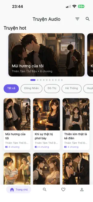
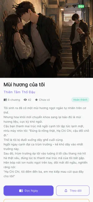
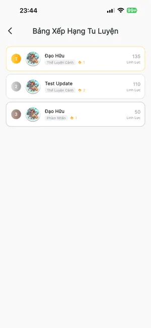
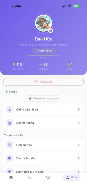
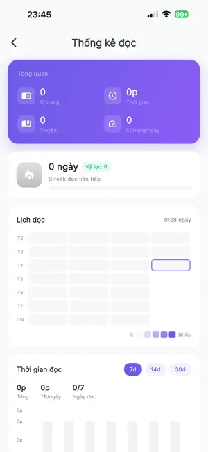
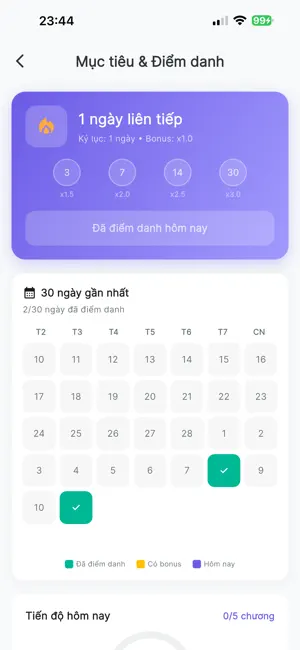
Sampled from 6 of Truyện Audio Hay Offline's App Store screenshots — background, accent and theme, measured by LaunchShots (not something Apple publishes).
#FCFCFC bg
#DDDDDD
#6C543C accent
#111111 text
Screenshots
Icon palette
About this app
Đọc Truyện Audio – Đánh thức mọi giác quan Bạn yêu thích những câu chuyện kiếm hiệp kỳ ảo, những mối tình ngôn tình sâu lắng hay những vụ án trinh thám nghẹt thở? Với Đọc Truyện Audio, thế giới văn học sẽ vang lên sống động ngay trong đôi tai của bạn. Tại sao bạn sẽ yêu thích ứng dụng này? Âm thanh chất lượng cao: Giọng đọc được tuyển chọn kỹ lưỡng, rõ ràng và đầy cảm xúc. Nghe mọi lúc mọi nơi: Dễ dàng tải về để nghe ngoại tuyến khi đi máy bay, tàu điện hoặc những nơi không có mạng. Cá nhân hóa trải nghiệm: Tự động lưu lịch sử đọc, đánh dấu chương đang đọc dở và tạo danh sách yêu thích riêng. Kho thể loại phong phú: Tiên hiệp, Kiếm hiệp huyền ảo. Ngôn tình, Đam mỹ lôi cuốn. Trinh thám, Kinh dị kịch tính. Truyện ma Nguyễn Ngọc Ngạn đặc sắc. Chúng tôi cam kết mang đến một không gian thư giãn tuyệt vời nhất cho tâm hồn bạn. Hãy tải ngay để bắt đầu hành trình âm thanh của riêng …
App details
What you can learn from Truyện Audio Hay Offline
Every shipping app on the App Store has gone through the same decisions you're working through right now: which screenshot goes first, what caption sits over it, which device frame to show, what color the background should be. The 6 screenshots above are Truyện Audio Hay Offline's answers to those questions — they're public, they're real, and they made it through Apple's review.
What the numbers say: Truyện Audio Hay Offline runs a light set with one background colour (#FCFCFC) carried across every screenshot — the listing reads as a single poster when the shots sit side by side in search results. The accent colour we picked up, #6C543C, is the one to reuse for badges, arrows and highlighted words if you borrow this look. Hit Use this style to open the editor with these exact colours and drop your own screenshot in.
Notice the first screenshot in particular. It's the one users see in search results and on the product page, and it's where most apps spend their best caption and tightest design. Look at the proportion of background to phone, where the text sits, what one thing the image is trying to communicate.
Want to see how other Book apps approach the same problem? Browse more Book apps in the showcase.
Take what works into your own screenshots
Open LaunchShots and design your App Store & Google Play screenshots — pick a device frame, drop captions, ship in minutes. Free, in your browser.
Open the screenshot editor →Apps with a similar look
Closest background + accent colours among the listings we've analysed — useful when you want to see the same palette handled by a different team.