Screenshot style breakdown
Sampled from 6 of CeliacHub's App Store screenshots — background, accent and theme, measured by LaunchShots (not something Apple publishes).
#FCC48C bg
#DDAC7B
#EC8414 accent
#111111 text
Screenshots


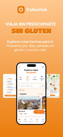

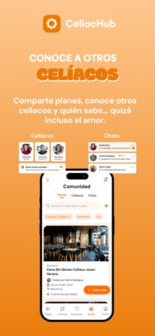


Icon palette
About this app
ENGLISH CeliacHub is your all-in-one app for living gluten-free! GLUTEN-FREE RESTAURANTS Discover safe places to eat near you and across Europe. TRAVEL Explore destinations and plan stress-free gluten-free trips. WELL-BEING Access helpful resources and tools to improve your daily life. COMMUNITY Meet other celiacs, join events, share experiences, and maybe even find love! Make gluten-free living easier, safer, and more social with CeliacHub! ESPAÑOL ¡CeliacHub es tu app para vivir sin gluten! RESTAURANTES SIN GLUTEN Descubre lugares seguros donde comer cerca de ti y por Europa. VIAJES Explora destinos y organiza viajes sin preocupaciones. BIENESTAR Accede a recursos y herramientas para mejorar tu día a día. COMUNIDAD Conoce a otros celíacos, únete a eventos, comparte experiencias y ¡quizá encuentra el amor! ¡Haz que vivir sin gluten sea más fácil, seguro y social con CeliacHub! Terms …
App details
What you can learn from CeliacHub
Every shipping app on the App Store has gone through the same decisions you're working through right now: which screenshot goes first, what caption sits over it, which device frame to show, what color the background should be. The 7 screenshots above are CeliacHub's answers to those questions — they're public, they're real, and they made it through Apple's review.
What the numbers say: CeliacHub runs a light set with one background colour (#FCC48C) carried across every screenshot — the listing reads as a single poster when the shots sit side by side in search results. The accent colour we picked up, #EC8414, is the one to reuse for badges, arrows and highlighted words if you borrow this look. Hit Use this style to open the editor with these exact colours and drop your own screenshot in.
Notice the first screenshot in particular. It's the one users see in search results and on the product page, and it's where most apps spend their best caption and tightest design. Look at the proportion of background to phone, where the text sits, what one thing the image is trying to communicate.
Want to see how other Food & Drink apps approach the same problem? Browse more Food & Drink apps in the showcase.
Take what works into your own screenshots
Open LaunchShots and design your App Store & Google Play screenshots — pick a device frame, drop captions, ship in minutes. Free, in your browser.
Open the screenshot editor →Apps with a similar look
Closest background + accent colours among the listings we've analysed — useful when you want to see the same palette handled by a different team.