Chart position — tracked daily by LaunchShots
Screenshot style breakdown
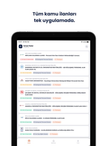
Sampled from 5 of Kamu İlanları – Kariyer Radar's App Store screenshots — background, accent and theme, measured by LaunchShots (not something Apple publishes).
#1C2C4C bg
#3B4965
#7CC4AC accent
#FFFFFF text
Screenshots


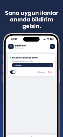
iPad screenshots

Icon palette
About this app
Kamu personel ilanlarını takip etmek artık çok kolay. Kariyer Radar, Türkiye genelindeki güncel kamu alım ilanlarını hızlı ve sade bir şekilde takip etmeni sağlar. Memur, sözleşmeli personel, işçi ve KPSS ile yapılan tüm alımları tek platformda görüntüleyebilirsin. Aradığın ilanı bulmak için sadece başlıklara bakmana gerek yok — arama ilan metinlerinin içine de bakıyor. "Sosyoloji" yazdığında, başlığında geçmese bile sosyoloji mezunu arayan ilanlar karşına çıkıyor. Yeni: Forum Aynı ilana başvuran, aynı sınava hazırlanan adaylarla aynı yerdesin. Mülakat nasıl geçiyor, hangi belge isteniyor, arşiv araştırması ne kadar sürüyor — sor, öğren, bildiğini paylaş. Gönderilerine görsel ekleyebilir, yorumlara yanıt verebilirsin. Rahatsız eden bir içerik görürsen bildir, istemediğin kişileri engelle. Öne çıkan özellikler: • Güncel kamu personel ilanlarını anında görüntüleme • İlan metinlerini…
App details
What you can learn from Kamu İlanları – Kariyer Radar
Every shipping app on the App Store has gone through the same decisions you're working through right now: which screenshot goes first, what caption sits over it, which device frame to show, what color the background should be. The 7 screenshots above are Kamu İlanları – Kariyer Radar's answers to those questions — they're public, they're real, and they made it through Apple's review.
What the numbers say: Kamu İlanları – Kariyer Radar runs a dark set with one background colour (#1C2C4C) carried across every screenshot — the listing reads as a single poster when the shots sit side by side in search results. The accent colour we picked up, #7CC4AC, is the one to reuse for badges, arrows and highlighted words if you borrow this look. Hit Use this style to open the editor with these exact colours and drop your own screenshot in.
Notice the first screenshot in particular. It's the one users see in search results and on the product page, and it's where most apps spend their best caption and tightest design. Look at the proportion of background to phone, where the text sits, what one thing the image is trying to communicate.
Want to see how other Business apps approach the same problem? Browse more Business apps in the showcase.
Take what works into your own screenshots
Open LaunchShots and design your App Store & Google Play screenshots — pick a device frame, drop captions, ship in minutes. Free, in your browser.
Open the screenshot editor →Apps with a similar look
Closest background + accent colours among the listings we've analysed — useful when you want to see the same palette handled by a different team.