Chart position — tracked daily by LaunchShots
Screenshot changes — detected by LaunchShots
Screenshot style breakdown
Sampled from 6 of Brewwww!'s App Store screenshots — background, accent and theme, measured by LaunchShots (not something Apple publishes).
#F4F4EC bg
#D6D6CF
#CC8C4C accent
#111111 text
Reading the caption text from the screenshots in your browser…
Screenshots


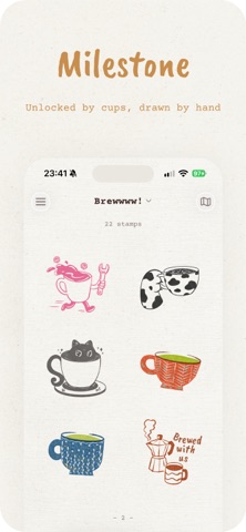
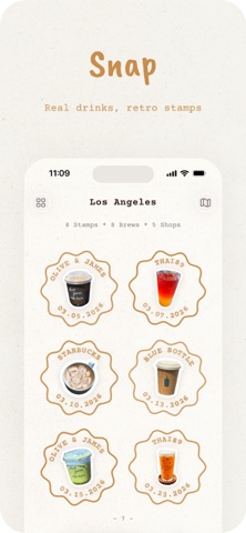

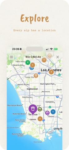

iPad screenshots


Icon palette
About this app
Brewwwww! 是为认真喝咖啡/奶茶/饮料的人打造的饮品记录 App。拍一张你手里的饮品,打造属于自己的日历!除了特别的日历,你还会收获一枚复古风邮戳印章,店名、日期、城市一应俱全!让日常的咖啡奶茶,变成一件可以回味的事情。 在 Momento 中留住完整回忆,建立属于你的拍立得收藏。按月份浏览双列照片墙,或逐张滑动回味每一杯。自定义相框颜色、回放 Live Photo 的动态瞬间,并将完成的拍立得卡片直接保存到“照片”。 日历会将每一个记录过的日子变成一篇可视化饮品日记,展示你真正喝过的饮品。切换月视图和周视图,回顾完整记录,查看去过多少家店,并选出本周最爱或本月最爱。随着探索不断延伸,地图上也会逐渐布满来自世界各地咖啡店和饮品店的足迹。 …
App details
What you can learn from Brewwww!
Every shipping app on the App Store has gone through the same decisions you're working through right now: which screenshot goes first, what caption sits over it, which device frame to show, what color the background should be. The 14 screenshots above are Brewwww!'s answers to those questions — they're public, they're real, and they made it through Apple's review.
What the numbers say: Brewwww! runs a light set with one background colour (#F4F4EC) carried across every screenshot — the listing reads as a single poster when the shots sit side by side in search results. The accent colour we picked up, #CC8C4C, is the one to reuse for badges, arrows and highlighted words if you borrow this look. Hit Use this style to open the editor with these exact colours and drop your own screenshot in.
Notice the first screenshot in particular. It's the one users see in search results and on the product page, and it's where most apps spend their best caption and tightest design. Look at the proportion of background to phone, where the text sits, what one thing the image is trying to communicate.
Want to see how other Food & Drink apps approach the same problem? Browse more Food & Drink apps in the showcase.
Take what works into your own screenshots
Open LaunchShots and design your App Store & Google Play screenshots — pick a device frame, drop captions, ship in minutes. Free, in your browser.
Open the screenshot editor →Apps with a similar look
Closest background + accent colours among the listings we've analysed — useful when you want to see the same palette handled by a different team.