Chart position — tracked daily by LaunchShots
Screenshot style breakdown
Sampled from 6 of SıfırAltı - Ankara Uygulaması's App Store screenshots — background, accent and theme, measured by LaunchShots (not something Apple publishes).
#040C24 bg
#272E42
#0C4C6C accent
#FFFFFF text
Reading the caption text from the screenshots in your browser…
Screenshots

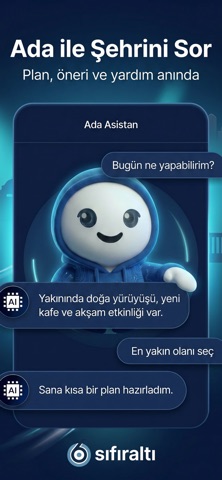

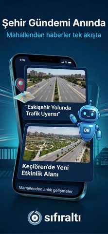
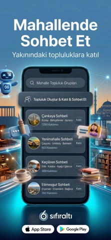
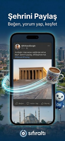

Icon palette
About this app
SıfırAltı, Ankara'da yaşayan ve şehri keşfetmek isteyen herkes için geliştirilmiş kapsamlı bir şehir yaşam uygulamasıdır. Haberden ulaşıma, sosyal medyadan yapay zeka asistanına kadar şehre dair ne ararsan tek uygulamada bulursun. Şehir Hizmetleri Nöbetçi eczaneler, otobüs saatleri, hava durumu, taksi erişimi, döviz kurları, iş ilanları, etkinlikler, gezilecek yerler, e-ticaret, ikinci el ilanlar ve şehir haritası — günlük ihtiyaçların tek ekranda. Haber ve Sosyal Akış Şehrine dair güncel haber akışı, sosyal paylaşımlar, hikayeler ve kısa videolarla Ankara gündemine dahil ol. Keşfet sekmesinde yeni insanlar ve içerikler bul, kendi içeriklerini oluştur. Ada Yapay Zeka Asistanı Ankara'ya özel yapay zeka asistanı Ada ile şehirle ilgili sorularına anında cevap al. Sohbet geçmişi, hazır prompt kartları ve görsel üretme özelliğiyle şehri farklı bir gözle keşfet. İşletme Rehberi İşletmeni daki…
App details
What you can learn from SıfırAltı - Ankara Uygulaması
Every shipping app on the App Store has gone through the same decisions you're working through right now: which screenshot goes first, what caption sits over it, which device frame to show, what color the background should be. The 7 screenshots above are SıfırAltı - Ankara Uygulaması's answers to those questions — they're public, they're real, and they made it through Apple's review.
What the numbers say: SıfırAltı - Ankara Uygulaması runs a dark set where the background shifts from screenshot to screenshot (first shot #040C24) — each image has to stand on its own, so the captions carry more of the story. The accent colour we picked up, #0C4C6C, is the one to reuse for badges, arrows and highlighted words if you borrow this look. Hit Use this style to open the editor with these exact colours and drop your own screenshot in.
Notice the first screenshot in particular. It's the one users see in search results and on the product page, and it's where most apps spend their best caption and tightest design. Look at the proportion of background to phone, where the text sits, what one thing the image is trying to communicate.
Want to see how other Social Networking apps approach the same problem? Browse more Social Networking apps in the showcase.
Take what works into your own screenshots
Open LaunchShots and design your App Store & Google Play screenshots — pick a device frame, drop captions, ship in minutes. Free, in your browser.
Open the screenshot editor →Apps with a similar look
Closest background + accent colours among the listings we've analysed — useful when you want to see the same palette handled by a different team.