Chart position — tracked daily by LaunchShots
Screenshot changes — detected by LaunchShots
Screenshot style breakdown
Sampled from 6 of TOPIK Note's App Store screenshots — background, accent and theme, measured by LaunchShots (not something Apple publishes).
#1C140C bg
#3B342E
#F4BC44 accent
#FFFFFF text
Screenshots




iPad screenshots



Icon palette
About this app
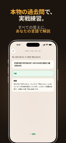
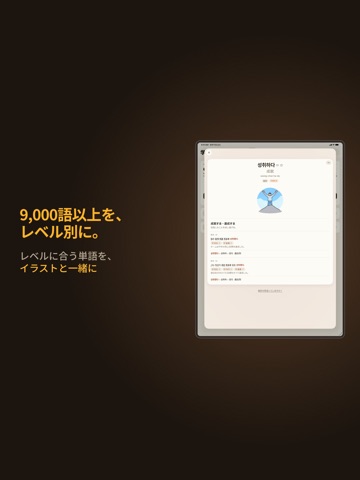
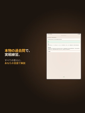
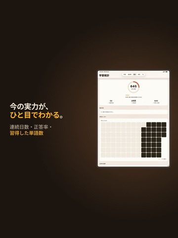
TOPIK合格を目指すことは、もう決まっている。問題は「どう進めるか」です——点数に結びつかない単語に時間を費やすことなく、必要のない復習で1週間を無駄にすることもなく。 TOPIK Noteは9,000語以上の韓国語をTOPIKレベル別に整理し、復習スケジュールまで自動で組み立てます。だから学習時間のすべてが「点数につながる単語」に向かう。大切なものを、大切なタイミングで学べます。 アプリがあなたの「知っている単語」と「まだの単語」を記憶します。SM-2間隔反復(8段階)がすべての解答を記録し、スケジュールを自動調整。苦手な単語は早めに、覚えた単語は間隔を広げて——すでに身についた単語を繰り返す無駄がありません。 1つの単語を4つの角度で • 韓国語を見て意味を選ぶ • 意味を見て韓国語を選ぶ • 文の空欄に合う単語を入れる • 韓国語の文を読んで意味を選ぶ 同じ単語を、4つの視点で。定着するころには、フラッシュカードで見分けるだけでなく、文脈の中で使えるようになります。36,000問以上のクイズで、ネタ切れの心配もありません。 すべての単語…
App details
What you can learn from TOPIK Note
Every shipping app on the App Store has gone through the same decisions you're working through right now: which screenshot goes first, what caption sits over it, which device frame to show, what color the background should be. The 12 screenshots above are TOPIK Note's answers to those questions — they're public, they're real, and they made it through Apple's review.
What the numbers say: TOPIK Note runs a dark set with one background colour (#1C140C) carried across every screenshot — the listing reads as a single poster when the shots sit side by side in search results. The accent colour we picked up, #F4BC44, is the one to reuse for badges, arrows and highlighted words if you borrow this look. Hit Use this style to open the editor with these exact colours and drop your own screenshot in.
Notice the first screenshot in particular. It's the one users see in search results and on the product page, and it's where most apps spend their best caption and tightest design. Look at the proportion of background to phone, where the text sits, what one thing the image is trying to communicate.
Want to see how other Education apps approach the same problem? Browse more Education apps in the showcase.
Take what works into your own screenshots
Open LaunchShots and design your App Store & Google Play screenshots — pick a device frame, drop captions, ship in minutes. Free, in your browser.
Open the screenshot editor →Apps with a similar look
Closest background + accent colours among the listings we've analysed — useful when you want to see the same palette handled by a different team.