Screenshot style breakdown
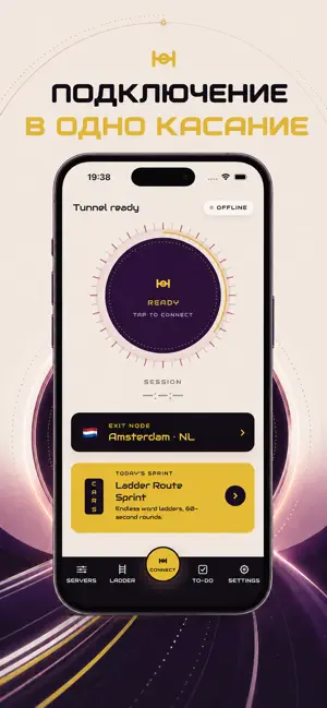
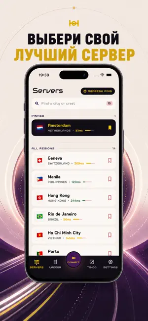
Sampled from 3 of Jump Jump VPN. Джамп ВПН's App Store screenshots — background, accent and theme, measured by LaunchShots (not something Apple publishes).
#F4ECE4 bg
#D6CFC8
#D4AC34 accent
#111111 text
Screenshots

Icon palette
About this app
Сколько ступеней вы сможете преодолеть за один Спринт по цепочке слов, пока ваше соединение остаётся полностью зашифрованным? Именно этот вопрос лежит в основе данного приложения — утилиты, которая отказывается быть обычной, сочетая надёжную виртуальную частную сеть с бесконечно генерируемым движком словесных цепочек и полноценной системой управления задачами. СПРИНТ ПО ЦЕПОЧКЕ СЛОВ Каждая сессия предлагает свежую цепочку допустимых слов, каждое из которых отличается от предыдущего всего на одну букву. Словарь тщательно отобран: исключены малоизвестные сокращения, и каждая ступень ощущается честной. Пройдите как можно больше трансформаций и наблюдайте, как ваша лингвистическая ловкость растёт с каждым завершённым забегом. ГЛОБАЛЬНАЯ СЕТЬ СЕРВЕРОВ Просматривайте серверы, организованные по странам, добавляйте избранные для мгновенного переподключения и фильтруйте по региону или задержке…
App details
What you can learn from Jump Jump VPN. Джамп ВПН
Every shipping app on the App Store has gone through the same decisions you're working through right now: which screenshot goes first, what caption sits over it, which device frame to show, what color the background should be. The 3 screenshots above are Jump Jump VPN. Джамп ВПН's answers to those questions — they're public, they're real, and they made it through Apple's review.
What the numbers say: Jump Jump VPN. Джамп ВПН runs a light set with one background colour (#F4ECE4) carried across every screenshot — the listing reads as a single poster when the shots sit side by side in search results. The accent colour we picked up, #D4AC34, is the one to reuse for badges, arrows and highlighted words if you borrow this look. Hit Use this style to open the editor with these exact colours and drop your own screenshot in.
Notice the first screenshot in particular. It's the one users see in search results and on the product page, and it's where most apps spend their best caption and tightest design. Look at the proportion of background to phone, where the text sits, what one thing the image is trying to communicate.
Want to see how other Utilities apps approach the same problem? Browse more Utilities apps in the showcase.
Take what works into your own screenshots
Open LaunchShots and design your App Store & Google Play screenshots — pick a device frame, drop captions, ship in minutes. Free, in your browser.
Open the screenshot editor →Apps with a similar look
Closest background + accent colours among the listings we've analysed — useful when you want to see the same palette handled by a different team.