Chart position — tracked daily by LaunchShots
Screenshot style breakdown
Sampled from 3 of f3 VPN. ф3 ВПН Сервис's App Store screenshots — background, accent and theme, measured by LaunchShots (not something Apple publishes).
#04040C bg
#27272E
#041C64 accent
#FFFFFF text
Screenshots
Icon palette
About this app
Это не ускоритель интернета. Он не поможет найти дешёвые авиабилеты, разблокировать сериалы из других стран или превратить ваш сёрфинг в игру с еженедельными значками достижений. Уберите маркетинговый театр, на который опирается большинство сетевых инструментов, и останется одна неудобная реальность: каждое ваше устройство транслирует ваше местоположение, привычки и личность любому, кто находится между вами и серверами, к которым вы подключаетесь. Настоящий вопрос — что вы собираетесь с этим делать? ◆ Глобальная сеть серверов — Подключайтесь через серверы на нескольких континентах с маршрутизацией, оптимизированной для стабильности соединения, а не для косметических анимаций на карте ◆ Аппаратный Kill Switch — В момент разрыва зашифрованного туннеля весь исходящий трафик полностью блокируется — без задержек, без утечек пакетов, без исключений ◆ Активация в одно касание — Выберите реги…
App details
What you can learn from f3 VPN. ф3 ВПН Сервис
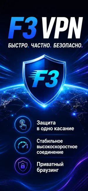
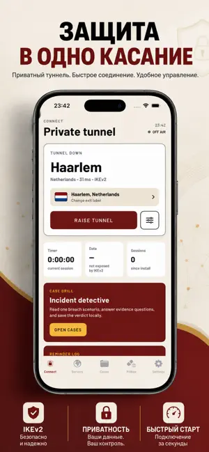
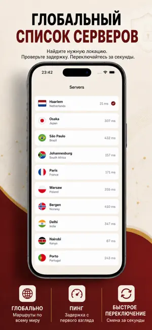
Every shipping app on the App Store has gone through the same decisions you're working through right now: which screenshot goes first, what caption sits over it, which device frame to show, what color the background should be. The 3 screenshots above are f3 VPN. ф3 ВПН Сервис's answers to those questions — they're public, they're real, and they made it through Apple's review.
What the numbers say: f3 VPN. ф3 ВПН Сервис runs a mixed light-and-dark set where the background shifts from screenshot to screenshot (first shot #04040C) — each image has to stand on its own, so the captions carry more of the story. The accent colour we picked up, #041C64, is the one to reuse for badges, arrows and highlighted words if you borrow this look. Hit Use this style to open the editor with these exact colours and drop your own screenshot in.
Notice the first screenshot in particular. It's the one users see in search results and on the product page, and it's where most apps spend their best caption and tightest design. Look at the proportion of background to phone, where the text sits, what one thing the image is trying to communicate.
Want to see how other Utilities apps approach the same problem? Browse more Utilities apps in the showcase.
Take what works into your own screenshots
Open LaunchShots and design your App Store & Google Play screenshots — pick a device frame, drop captions, ship in minutes. Free, in your browser.
Open the screenshot editor →Apps with a similar look
Closest background + accent colours among the listings we've analysed — useful when you want to see the same palette handled by a different team.