Chart position — tracked daily by LaunchShots
Screenshot changes — detected by LaunchShots
Screenshot style breakdown
Sampled from 4 of 趣伴学英语's App Store screenshots — background, accent and theme, measured by LaunchShots (not something Apple publishes).
#0484FC bg
#2795FC
#84CCFC accent
#FFFFFF text
Reading the caption text from the screenshots in your browser…
Screenshots


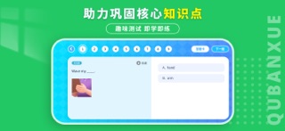
iPad screenshots


Icon palette
About this app
一款专注英语自然拼读学习的应用,围绕“字母认知、发音规律、拼读训练、听读跟读、练习巩固”设计完整学习路径,帮助用户逐步建立字母与发音、发音与拼读之间的对应关系,为后续英语阅读与表达打下更扎实的基础。 应用聚焦自然拼读内容,覆盖5个Level、52节课程,学习内容循序渐进,适配学习者按阶段持续学习。课程采用多种学习方式结合,避免只看不练、走马观花式学习,助力用户更高效地理解和掌握自然拼读知识。 核心内容 自然拼读分级学习,循序渐进提升 课程覆盖5个Level、52节课,按照由浅入深的方式逐步展开,帮助用户从基础认知开始,逐步过渡到更系统的拼读训练。 多种学习模式结合,学习过程更完整 应用内提供以下学习模式: - 单词预习:提前熟悉重点单词,降低正式学习难度 - 绘本原音:通过标准发音输入,建立正确听感 - 绘本跟读:边听边读,强化模仿与输出能力 - 视频精讲:解析发音规律、拼读方法和重点内容 - 趣味测试:学后及时检测,巩固学习成果 精讲+练习结合,避免无效学习 通过“听、读、讲、练、测”多环节结合,让用户不只是浏览学习内容,而是…
App details
What you can learn from 趣伴学英语
Every shipping app on the App Store has gone through the same decisions you're working through right now: which screenshot goes first, what caption sits over it, which device frame to show, what color the background should be. The 8 screenshots above are 趣伴学英语's answers to those questions — they're public, they're real, and they made it through Apple's review.
What the numbers say: 趣伴学英语 runs a mixed light-and-dark set where the background shifts from screenshot to screenshot (first shot #0484FC) — each image has to stand on its own, so the captions carry more of the story. The accent colour we picked up, #84CCFC, is the one to reuse for badges, arrows and highlighted words if you borrow this look. Hit Use this style to open the editor with these exact colours and drop your own screenshot in.
Notice the first screenshot in particular. It's the one users see in search results and on the product page, and it's where most apps spend their best caption and tightest design. Look at the proportion of background to phone, where the text sits, what one thing the image is trying to communicate.
Want to see how other Education apps approach the same problem? Browse more Education apps in the showcase.
Take what works into your own screenshots
Open LaunchShots and design your App Store & Google Play screenshots — pick a device frame, drop captions, ship in minutes. Free, in your browser.
Open the screenshot editor →Apps with a similar look
Closest background + accent colours among the listings we've analysed — useful when you want to see the same palette handled by a different team.