Screenshot changes — detected by LaunchShots
Screenshot style breakdown
Sampled from 5 of Party Card - Uitgaansbingo's App Store screenshots — background, accent and theme, measured by LaunchShots (not something Apple publishes).
#040404 bg
#272727
#FC244C accent
#FFFFFF text
Reading the caption text from the screenshots in your browser…
Screenshots
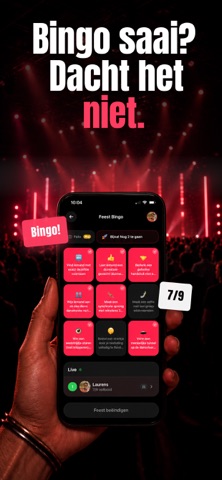
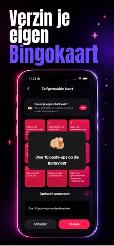

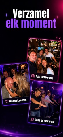

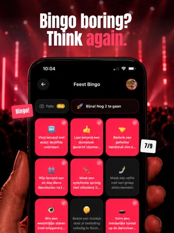
iPad screenshots


Icon palette
About this app
Party Card is het bingo-achtige partyspel dat elke avond onvergetelijk maakt. Ontvang je persoonlijke bingokaart vol met 500+ challenges, vink ze af terwijl de avond zich ontvouwt en race tegen je vrienden naar BINGO. HOE HET WERKT → Maak een party aan en deel de code met je vriendengroep → Iedereen krijgt direct een eigen bingokaart → Voltooi challenges tijdens de avond → De eerste met BINGO wint de eeuwige opscheprechten WAT HET LEUK MAAKT - 500+ challenges in allerlei stijlen: sociaal, gedurfd en hilarisch - Maak je eigen kaart: voeg persoonlijke opdrachten toe die alleen jullie groep begrijpt - Iedereen speelt samen: één code, iedereen doet mee - Leg momenten vast: fotomomenten van de beste avonden - Werkt overal: huisfeest, kroegentocht, verjaardag, festival, pre-drinks of nightlife Snel op te zetten. Geen ingewikkelde regels. Scan de code, pak je kaart en laat de avond zijn wer…
App details
What you can learn from Party Card - Uitgaansbingo
Every shipping app on the App Store has gone through the same decisions you're working through right now: which screenshot goes first, what caption sits over it, which device frame to show, what color the background should be. The 8 screenshots above are Party Card - Uitgaansbingo's answers to those questions — they're public, they're real, and they made it through Apple's review.
What the numbers say: Party Card - Uitgaansbingo runs a dark set with one background colour (#040404) carried across every screenshot — the listing reads as a single poster when the shots sit side by side in search results. The accent colour we picked up, #FC244C, is the one to reuse for badges, arrows and highlighted words if you borrow this look. Hit Use this style to open the editor with these exact colours and drop your own screenshot in.
Notice the first screenshot in particular. It's the one users see in search results and on the product page, and it's where most apps spend their best caption and tightest design. Look at the proportion of background to phone, where the text sits, what one thing the image is trying to communicate.
Want to see how other Lifestyle apps approach the same problem? Browse more Lifestyle apps in the showcase.
Take what works into your own screenshots
Open LaunchShots and design your App Store & Google Play screenshots — pick a device frame, drop captions, ship in minutes. Free, in your browser.
Open the screenshot editor →Apps with a similar look
Closest background + accent colours among the listings we've analysed — useful when you want to see the same palette handled by a different team.