Screenshot style breakdown
Sampled from 6 of Grook ИИ - Чат Ассистент's App Store screenshots — background, accent and theme, measured by LaunchShots (not something Apple publishes).
#FCFCFC bg
#DDDDDD
#845C3C accent
#111111 text
- #2= "Alice" # stores text =25 # stores a number "Hello, World!" Example
- #4Тарло 0p
- #5This appears to be a Fly Agaric mushroom,
Captions read from the screenshots (OCR, may contain small errors): 3 headlines, 7.7 words on average (longest 13).
Screenshots


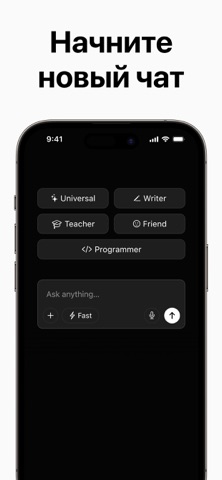
iPad screenshots


Icon palette
About this app
Наше приложение — это интеллектуальный помощник на основе искусственного интеллекта, созданный для улучшения ваших коммуникативных навыков, повышения эффективности и оптимизации рутинных задач. Независимо от того, нужны ли вам быстрые ответы, поддержка в создании контента, генерация идей или приобретение новых знаний, приложение предлагает простой и удобный способ взаимодействия с передовым искусственным интеллектом. Наслаждайтесь плавными, реалистичными диалогами с интеллектуальными, контекстно-зависимыми ответами, адаптированными под ваши потребности. От помощи в написании и уточнении текста до сжатия информации, четких объяснений, инновационного мышления и практического решения проблем — инструмент предоставляет надежную помощь по множеству тем. Благодаря элегантному и интуитивно понятному дизайну, приложение предоставляет мощные возможности ИИ пользователям всех уровней. Независимо …
App details
What you can learn from Grook ИИ - Чат Ассистент
Every shipping app on the App Store has gone through the same decisions you're working through right now: which screenshot goes first, what caption sits over it, which device frame to show, what color the background should be. The 14 screenshots above are Grook ИИ - Чат Ассистент's answers to those questions — they're public, they're real, and they made it through Apple's review.
What the numbers say: Grook ИИ - Чат Ассистент runs a light set with one background colour (#FCFCFC) carried across every screenshot — the listing reads as a single poster when the shots sit side by side in search results. The accent colour we picked up, #845C3C, is the one to reuse for badges, arrows and highlighted words if you borrow this look. Hit Use this style to open the editor with these exact colours and drop your own screenshot in.
Notice the first screenshot in particular. It's the one users see in search results and on the product page, and it's where most apps spend their best caption and tightest design. Look at the proportion of background to phone, where the text sits, what one thing the image is trying to communicate.
Want to see how other Productivity apps approach the same problem? Browse more Productivity apps in the showcase.
Take what works into your own screenshots
Open LaunchShots and design your App Store & Google Play screenshots — pick a device frame, drop captions, ship in minutes. Free, in your browser.
Open the screenshot editor →Apps with a similar look
Closest background + accent colours among the listings we've analysed — useful when you want to see the same palette handled by a different team.