Chart position — tracked daily by LaunchShots
Screenshot changes — detected by LaunchShots
Screenshot style breakdown
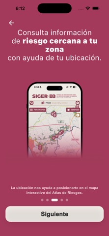
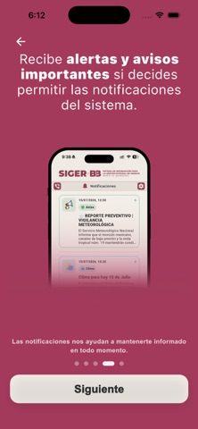
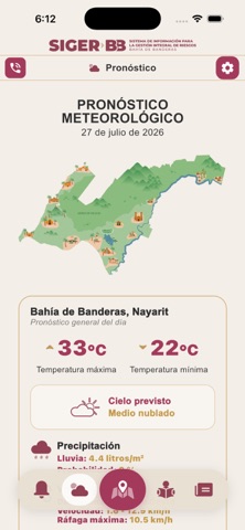
Sampled from 6 of SIGER Bahía de Banderas's App Store screenshots — background, accent and theme, measured by LaunchShots (not something Apple publishes).
#A43C5C bg
#B05772
#CC849C accent
#FFFFFF text
Reading the caption text from the screenshots in your browser…
Screenshots






iPad screenshots


Icon palette
About this app
SIGER Bahía de Banderas es la aplicación móvil del Sistema Integral de Riesgos de Bahía de Banderas. Concentra en un solo espacio información territorial, meteorológica y preventiva para ayudarte a comprender las condiciones del municipio y tomar decisiones informadas ante fenómenos naturales y situaciones de riesgo. Desde la aplicación podrás: • Explorar mapas de riesgos y consultar información por zona. • Revisar pronósticos y condiciones meteorológicas. • Recibir avisos preventivos y notificaciones relevantes. • Consultar recomendaciones, noticias y canales institucionales. • Acceder a información útil para fortalecer tu preparación y la de tu familia. SIGER Bahía de Banderas acerca la gestión del riesgo a la ciudadanía mediante información clara, visual y accesible. Su desarrollo se alinea con los principios de alerta temprana promovidos por la Oficina de las Nacio…
App details
What you can learn from SIGER Bahía de Banderas
Every shipping app on the App Store has gone through the same decisions you're working through right now: which screenshot goes first, what caption sits over it, which device frame to show, what color the background should be. The 19 screenshots above are SIGER Bahía de Banderas's answers to those questions — they're public, they're real, and they made it through Apple's review.
What the numbers say: SIGER Bahía de Banderas runs a mixed light-and-dark set where the background shifts from screenshot to screenshot (first shot #A43C5C) — each image has to stand on its own, so the captions carry more of the story. The accent colour we picked up, #CC849C, is the one to reuse for badges, arrows and highlighted words if you borrow this look. Hit Use this style to open the editor with these exact colours and drop your own screenshot in.
Notice the first screenshot in particular. It's the one users see in search results and on the product page, and it's where most apps spend their best caption and tightest design. Look at the proportion of background to phone, where the text sits, what one thing the image is trying to communicate.
Want to see how other Weather apps approach the same problem? Browse more Weather apps in the showcase.
Take what works into your own screenshots
Open LaunchShots and design your App Store & Google Play screenshots — pick a device frame, drop captions, ship in minutes. Free, in your browser.
Open the screenshot editor →Apps with a similar look
Closest background + accent colours among the listings we've analysed — useful when you want to see the same palette handled by a different team.