Chart position — tracked daily by LaunchShots
Screenshot style breakdown
Sampled from 5 of Đế Quốc Quật Khởi-Tân Thế Kỷ's App Store screenshots — background, accent and theme, measured by LaunchShots (not something Apple publishes).
#140C0C bg
#342E2E
#5C3C2C accent
#FFFFFF text
Screenshots
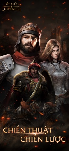

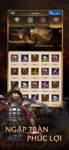
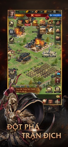
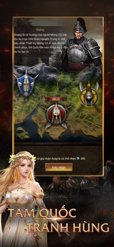
Icon palette
About this app
1. Mở đầu 3 nông dân, tái hiện 100% Đế Chế Tái xuất kinh điển, tái hiện thời đại Đế Chế vẹn nguyên 2. Bản đồ thật! Phát triển khoa kỹ đoạt lãnh địa tài nguyên Bản đồ chân thực rộng lớn, hàng vạn người chung màn hình, cùng cảm nhận trận chiến cực đã 3. Đế Chế viễn chinh! Trải nghiệm chân thực chiến dịch cổ đại danh tiếng Đánh nhanh, thắng nhanh, vô số chiến lược tạo nên các chiến dịch khác biệt 4. Anh hùng tập kết! Anh hùng sử thi quyết chiến danh tướng lịch sử Anh hùng mọi thời đại cùng tập kết, vị trí bá chủ trong tầm tay 5. Gặp gỡ giai nhân! Tận hưởng cuộc sống đế vương trong tiết tấu nhanh Gặp gỡ giai nhân tuyệt sắc, nắm tay bên nhau trọn đời, tận hưởng cuộc sống đế vương ba ngàn giai lệ 6. Tạo dựng phe! Hợp sức cùng minh hữu tranh Thánh Vực Xây dựng Đế Chế lớn mạnh, công thành đoạt đất cùng minh hữu, sư đồ, kề vai sát cánh trên hành trình phục hưng Đế Chế
App details
What you can learn from Đế Quốc Quật Khởi-Tân Thế Kỷ
Every shipping app on the App Store has gone through the same decisions you're working through right now: which screenshot goes first, what caption sits over it, which device frame to show, what color the background should be. The 5 screenshots above are Đế Quốc Quật Khởi-Tân Thế Kỷ's answers to those questions — they're public, they're real, and they made it through Apple's review.
What the numbers say: Đế Quốc Quật Khởi-Tân Thế Kỷ runs a dark set with one background colour (#140C0C) carried across every screenshot — the listing reads as a single poster when the shots sit side by side in search results. The accent colour we picked up, #5C3C2C, is the one to reuse for badges, arrows and highlighted words if you borrow this look. Hit Use this style to open the editor with these exact colours and drop your own screenshot in.
Notice the first screenshot in particular. It's the one users see in search results and on the product page, and it's where most apps spend their best caption and tightest design. Look at the proportion of background to phone, where the text sits, what one thing the image is trying to communicate.
Want to see how other Games apps approach the same problem? Browse more Games apps in the showcase.
Take what works into your own screenshots
Open LaunchShots and design your App Store & Google Play screenshots — pick a device frame, drop captions, ship in minutes. Free, in your browser.
Open the screenshot editor →Apps with a similar look
Closest background + accent colours among the listings we've analysed — useful when you want to see the same palette handled by a different team.