Chart position — tracked daily by LaunchShots
Screenshot style breakdown
Sampled from 6 of Akıllı Saha's App Store screenshots — background, accent and theme, measured by LaunchShots (not something Apple publishes).
#040C14 bg
#272E34
#54CCCC accent
#FFFFFF text
Reading the caption text from the screenshots in your browser…
Screenshots
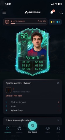

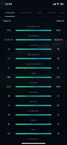
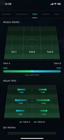
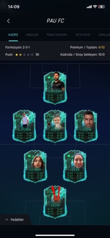
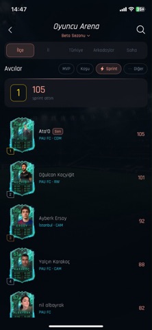
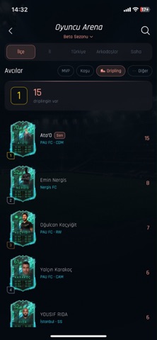
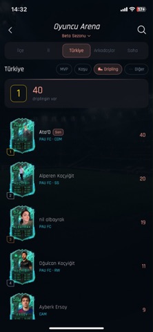
Icon palette
About this app
Maç biter ama yaptıkların kaybolmaz. Takımınla liglere gir, kartın güçlensin. Her hareketin bir istatistiğe dönüşür ve profilinde birikir. Halı sahadaki o gece, bir futbol fenomenine dönüşmenin ilk sahnesi olabilir. AKILLI SAHA Halı saha maçlarını kayıt, izleme ve rekabete çeviren futbol uygulaması. Telefonunla gir, takımını kur, ligde yerini al. Düdük çalınca kayıt hazırdır; istatistiklerin kartına işlenir. TAKIMINLA LİGE ÇIK • Takımını oluştur, kadronu kur, sahaya birlikte çık • Lig tablosunda yerini gör, sıralamayı takip et • Bireysel takıl veya takımınla yarış. Sahadaki adın uygulamada büyür FENOMEN OL Her maç bir iddia. Hızın, mesafen, gollerin kartına yazılır. • Her maç kartına bir iz bırakır, profilin o izi büyütür • Oyuncu kartın maçtan maça güçlenir • İstatistiklerin konuşur; halı sahanın konuşulan ismi sen olursun MAÇINI İZLE • QR okut, saha seç veya oluşturulmuş maça kat…
App details
What you can learn from Akıllı Saha
Every shipping app on the App Store has gone through the same decisions you're working through right now: which screenshot goes first, what caption sits over it, which device frame to show, what color the background should be. The 8 screenshots above are Akıllı Saha's answers to those questions — they're public, they're real, and they made it through Apple's review.
What the numbers say: Akıllı Saha runs a dark set with one background colour (#040C14) carried across every screenshot — the listing reads as a single poster when the shots sit side by side in search results. The accent colour we picked up, #54CCCC, is the one to reuse for badges, arrows and highlighted words if you borrow this look. Hit Use this style to open the editor with these exact colours and drop your own screenshot in.
Notice the first screenshot in particular. It's the one users see in search results and on the product page, and it's where most apps spend their best caption and tightest design. Look at the proportion of background to phone, where the text sits, what one thing the image is trying to communicate.
Want to see how other Sports apps approach the same problem? Browse more Sports apps in the showcase.
Take what works into your own screenshots
Open LaunchShots and design your App Store & Google Play screenshots — pick a device frame, drop captions, ship in minutes. Free, in your browser.
Open the screenshot editor →Apps with a similar look
Closest background + accent colours among the listings we've analysed — useful when you want to see the same palette handled by a different team.